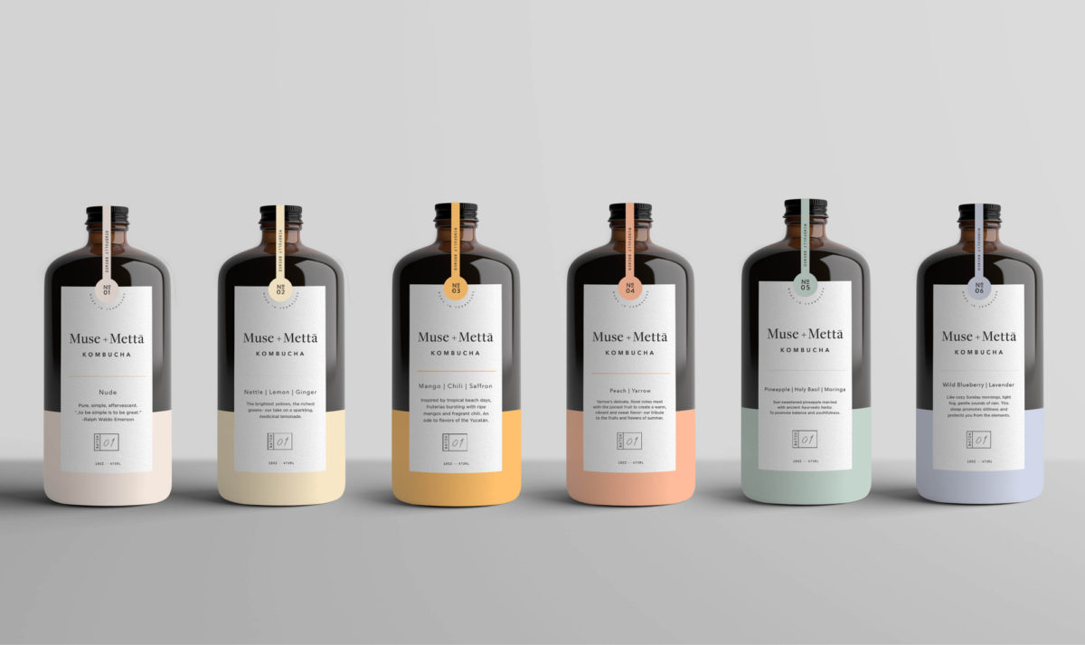
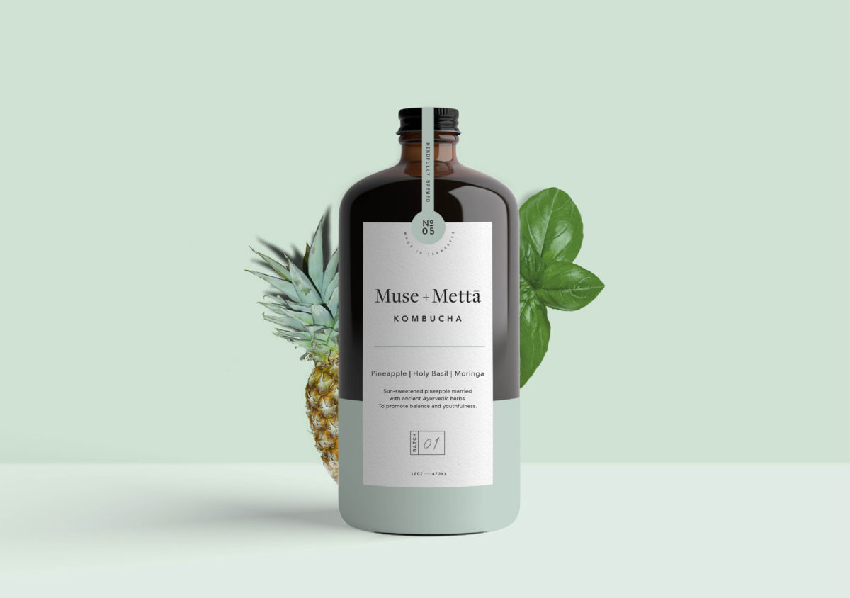
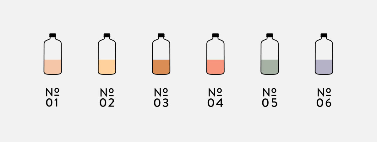
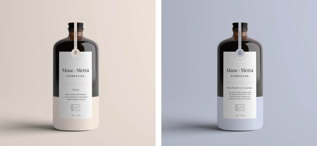
Kombucha brands tend to visually focus more on typical wellness tropes due to its association with yoga culture; colorful mandalas, soft botanical shapes and colors, etc. However, as the fermented tea grows in popularity and becomes more mainstream, each new brand that enters the competitive landscape has to do something different to stand out. Muse + Metta takes a beautifully minimal, quiet approach to their brand and bottles, using soft pastels and plenty of white space to draw the eye.
Muse + Metta Kombucha Branding & Packaging by Kati Forner.


