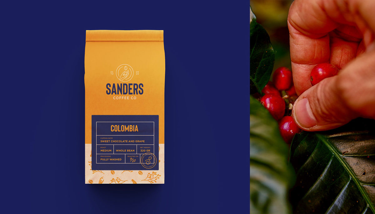
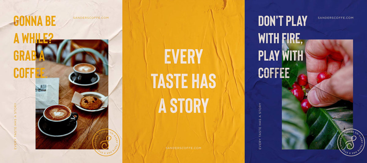
The thing we love the most about coffee is how universal it is, no matter where it is from and how unique it may be, we all find a way to appropriate it and give it whatever meaning we desire. Sanders approaches coffee from a modern and minimal perspective. It’s colorful, refined, playful, and youthful.
The visual identity blends photography, illustration, and type in a way that makes the product relevant and appealing to a younger audience, yet maintaining some traditional product photography.
Sanders Coffee Co. Branding by Abdulsamad Umar
