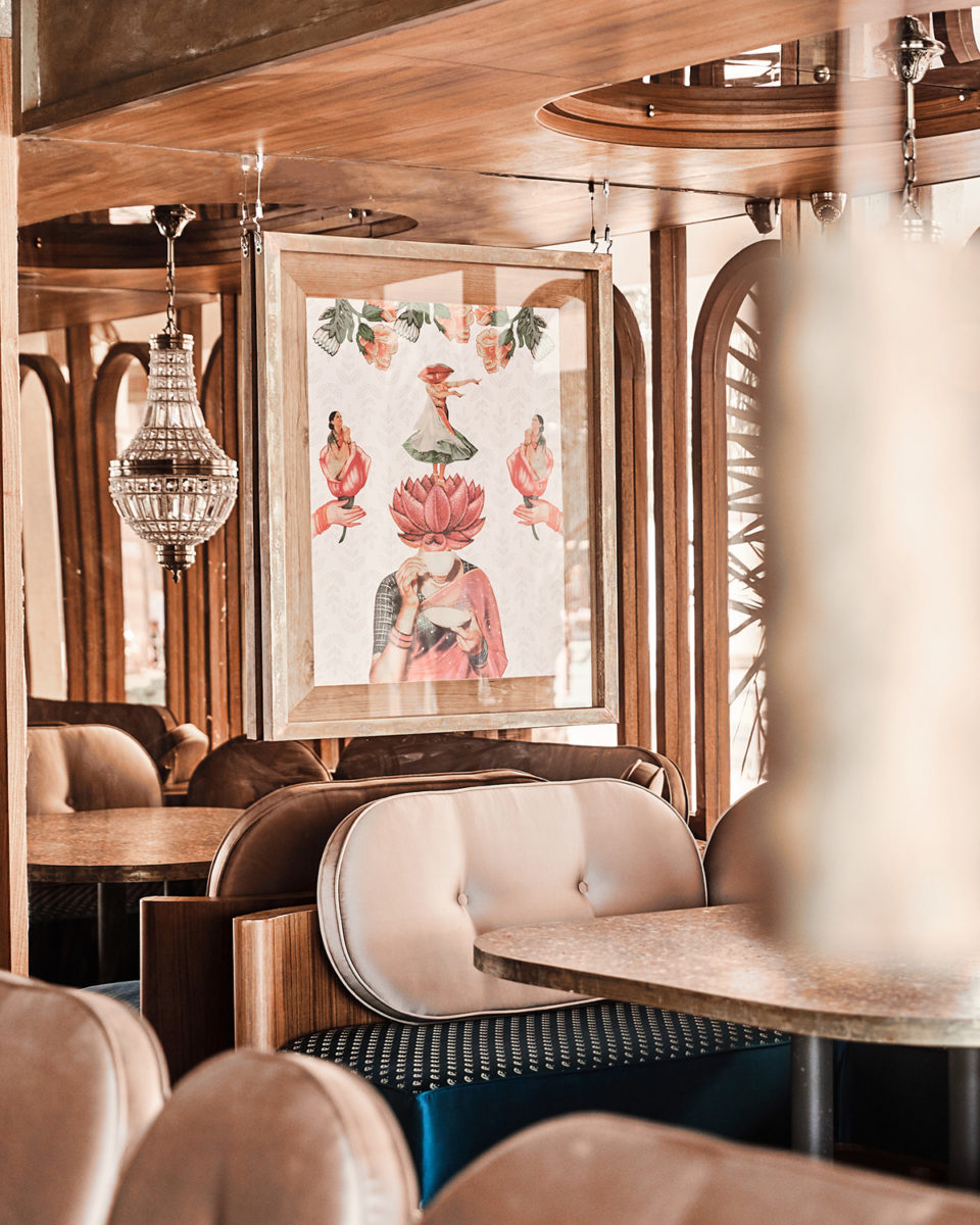
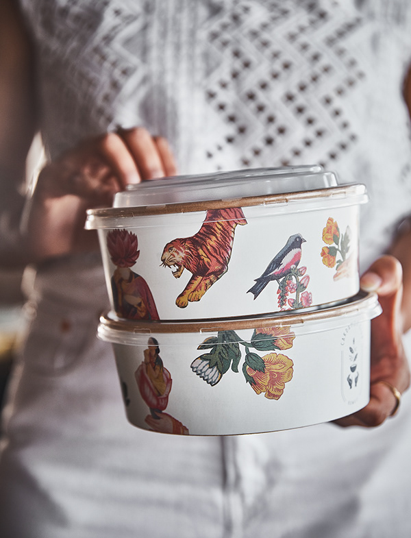
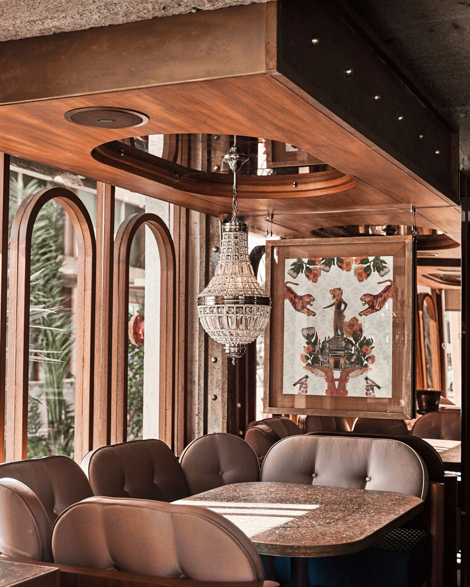
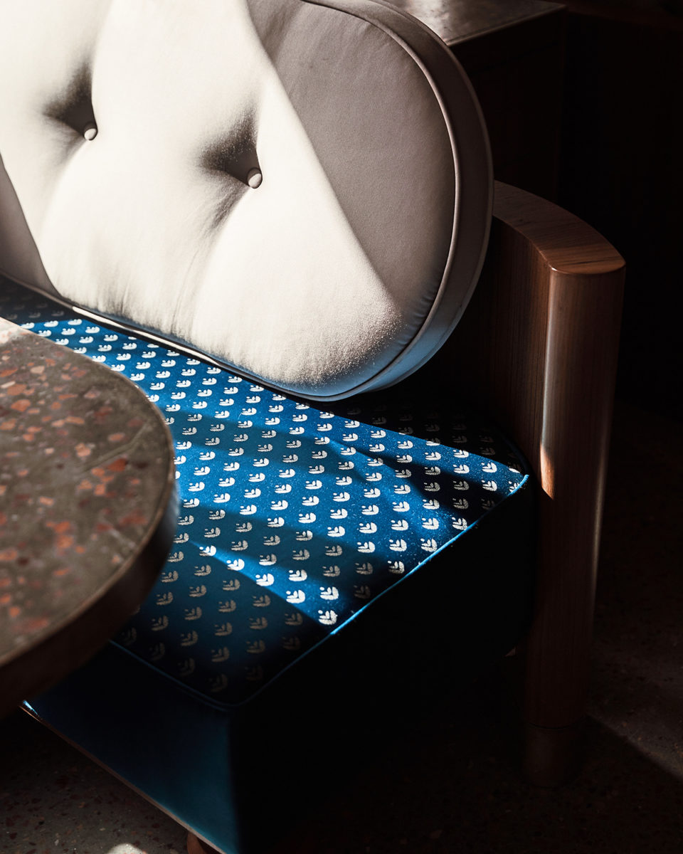
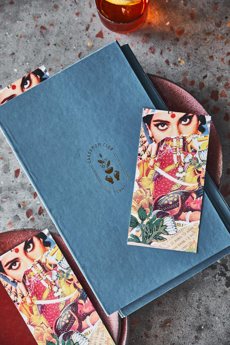
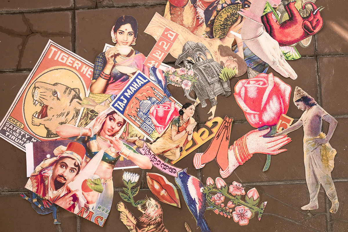
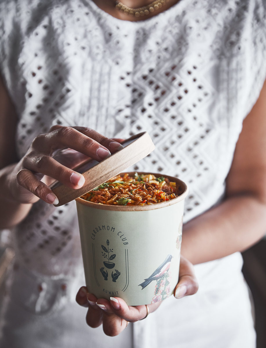
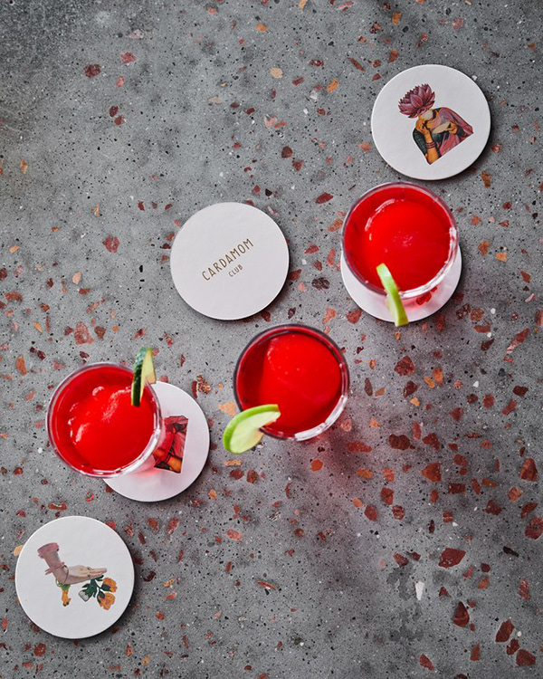
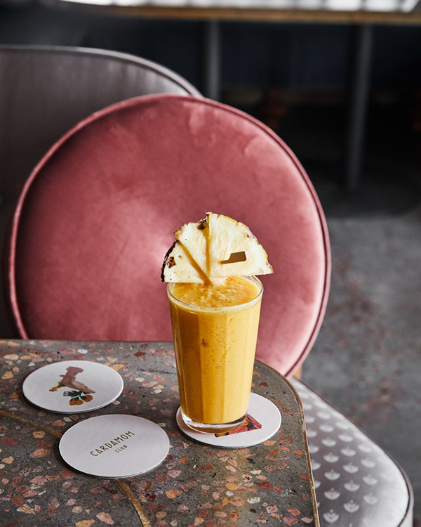
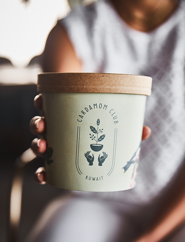
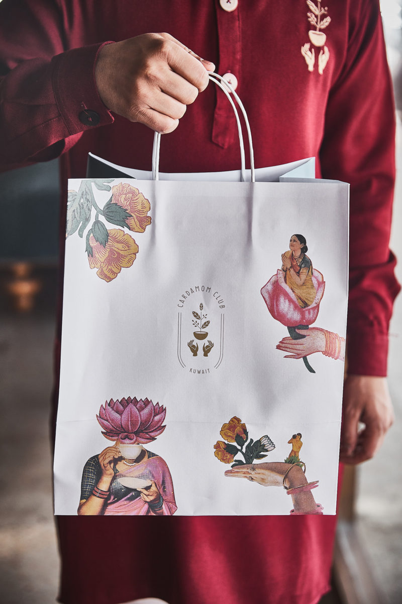
Cardamom Club serves contemporary North Indian cuisine and is inspired by the architecture of the region, drawing parallels in its interior design to the Pink City of Jaipur. Luxurious and ornate interiors contrast play well with Eszter Laki’s whimsical collages, serving as interior art and patterns across various branded touchpoints. These collaged motifs were collected from a series of vintage Indian printed media, such as posters, newspapers, and matchboxes, and reconstructed to create fictional landscapes and intriguing compositions. The restaurant’s logo focuses on a pair of hands raising up a bowl with a cardamom plant growing out of it; in addition to being on-trend, the posture and representation of hands is a common motif in Indian culture, and we love when a trend makes conceptual sense for an identity. A great detail not to miss in this case study is the take out packaging. Often restaurants won’t splurge on bespoke take-out packaging because it ends up being something that the guest throws away. Even so, Cardamom Club has given importance to those pieces, designing them and allowing their restaurant experience to be taken home.
Cardamom Club Restaurant Branding by Studio Nur.
