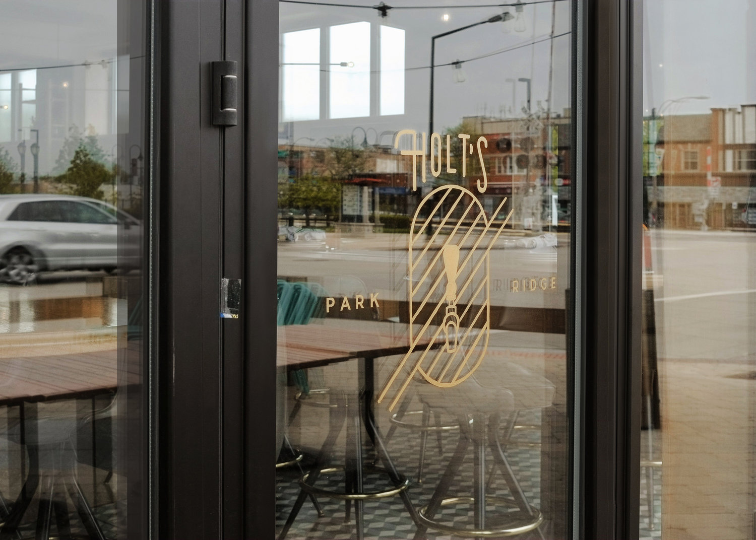
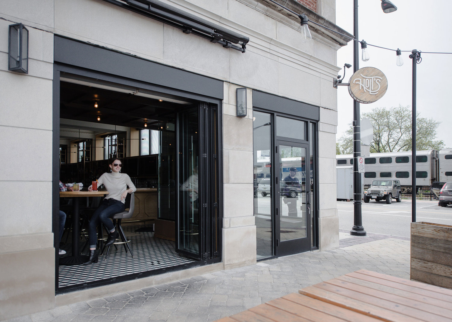
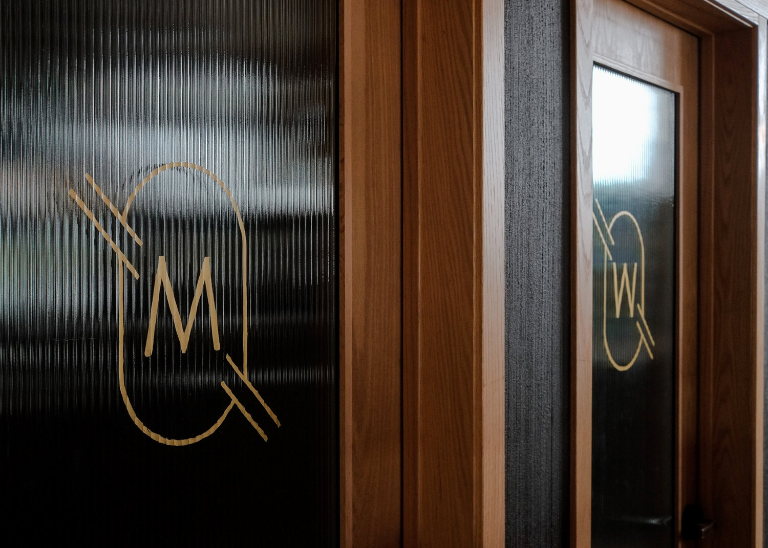
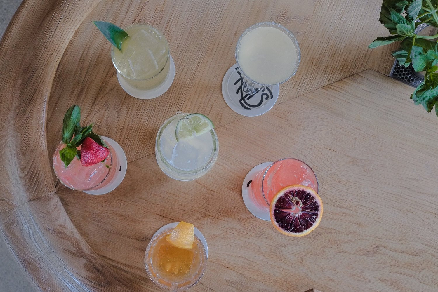
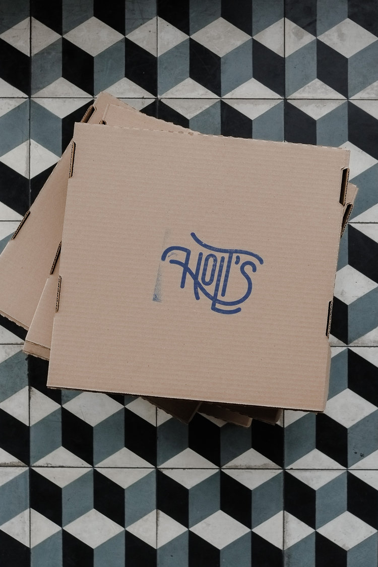
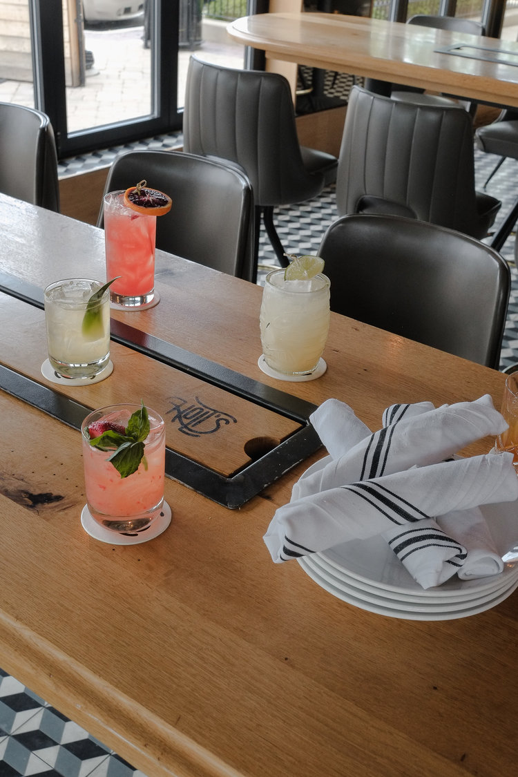
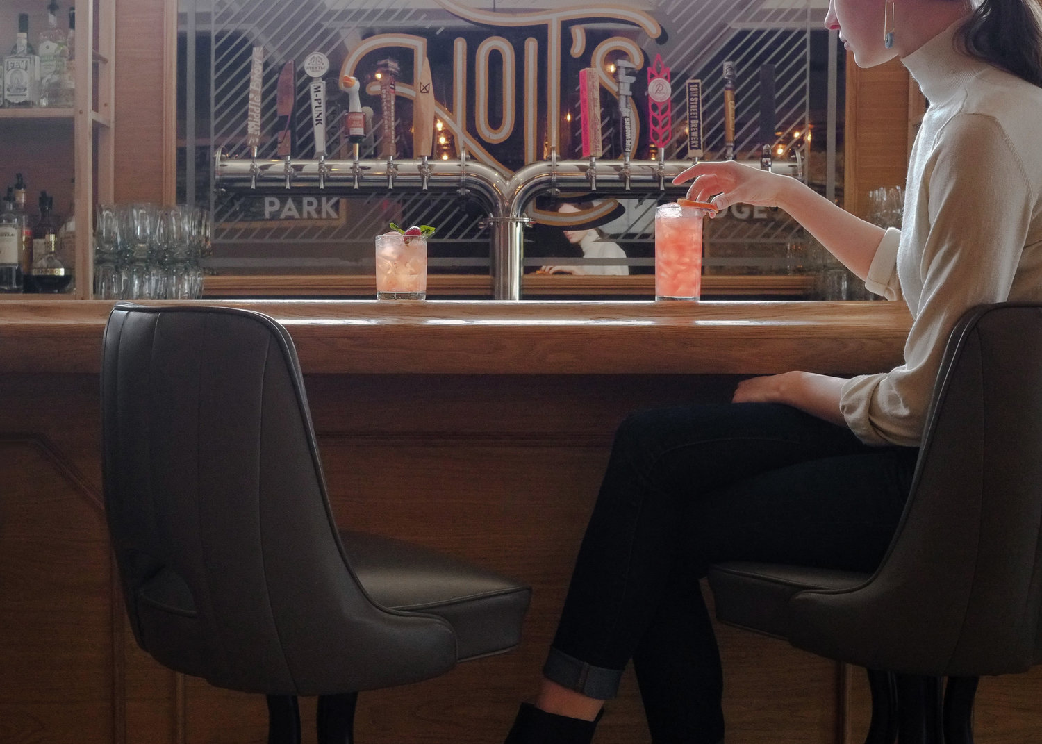
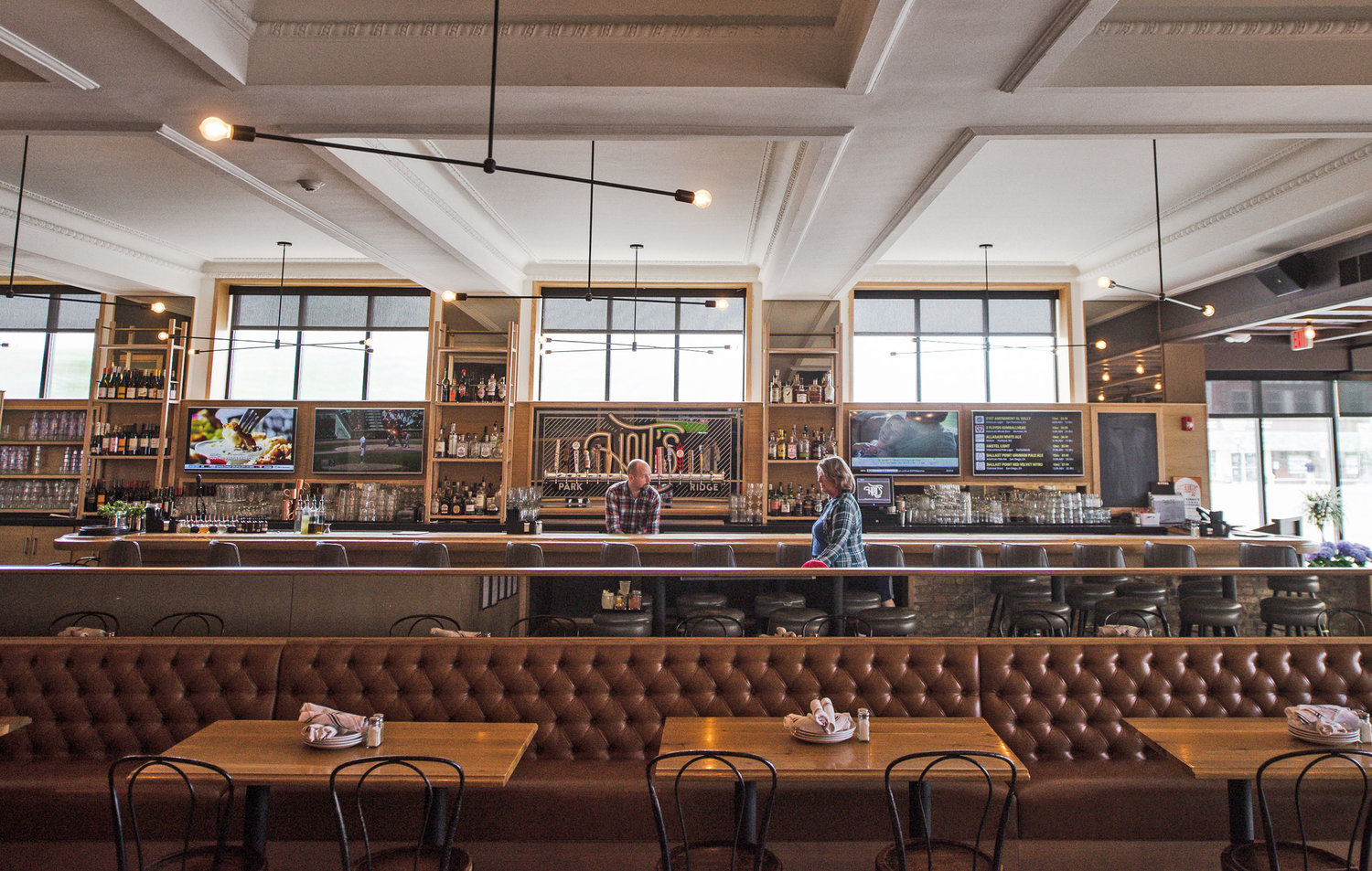
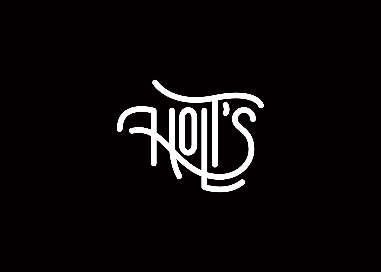
We love a good local joint, and that is exactly what this restaurant located in the heart of downtown Park Ridge is. Holt’s is well known for their approachable and friendly staff, great food, and a warm and easy-going vibe no wonder why it has become a favorite for the locals around it. Whenever you have a brand the audience already loves and are familiar with, it becomes a challenge to change anything about their identity. That is why the folks from LAT knew from the get-go that they needed to create something with personality but that at the same time would be relatable to all the different broad variety of customers. To make an adaptable and dynamic brand that would live in different spaces. The solution this team came up with is very unconventional in the branding world, which makes it all the more valuable and successful. Instead of having just one logo, these folks created several variations of the same logotype. Starting with the main logo they went on to modify it based on the place it would inhabit, either simplifying it or altering the shapes and details. Though the differences are subtle, it is such a delight to be discovering how this logo transforms itself depending on the location, both paying honor to the diverse crowds that are usuals and the friendly and accomodating essence of this restaurant.
Holt’s Rebranding by La Tortillería (LAT)
