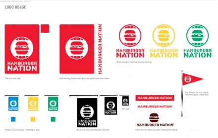
Choc full of icons and illustrations, Burger Nation (designed by Red Antler) has as modern, campy style brand that exudes a fun, lively vibe. I think this brand works well because of its diversity amongst the many touch points. They all have different messaging and feeling, but are all part of the same family. This isn’t always executed properly, but when done right, it creates a fluid restaurant brand that can move and grow.


