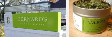
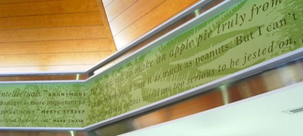
Bernard’s market and cafe is green… totally green. The brand exudes an image of health, organic and sustainability from soup to nuts.. er… should i say, from sign to products. The B brand mark stands on its own as a strong, identifiable and memorable icon where the typography, although classic, is fresh and stable. Great work by Strohl.


One Response