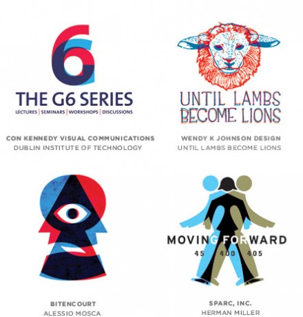
Logo trends are usually easy to spot, but here’s a solid round-up of current trends in the logo design world.
Nostalgia is often a key way to allow a logo to connect with its audience. That can be created in many ways, but the overlaying of 3-D images is not only popular, it’s reminiscent of a feature that was once hard to come by and offers excitement for a target audience. That’s a goal of all logo design, but in the case of offset imaging, it not only captures the nostalgia, but also the current state of 3-D, especially in movies aimed at all ages. A 3-D flick promises engagement, an interactive reality that makes you feel like you can reach out and touch the movie.
3-D logos also encourage the viewer to pause on the image and linger. Though the intent of the logo is usually clear immediately, there’s the promise of additional meanings if one looks a little longer.
On the other hand, a literal 3-D logo is often too complex, and at times trite, for such a foundational aspect of a logo and ultimately a brand. A confusing image representing a company, effort or product is a quick way to be forgettable.
Trends are great and they are such for a reason, but there’s never a replacement for a clean and concise logo that gives a lot of punch for a little activity. Using your logo to provide maximum meaning with minimal means will always trump literal and reality-based messages.


2 Responses
Its a revival trend that I really appreciate specially when there are unrefined edges to mimic silk screening
Some of the revival trends I like. Some, not so much. Part of me thinks of the theories in The Fountainhead regarding architecture. That obviously is seen in my own work.