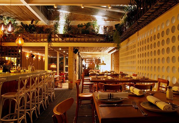
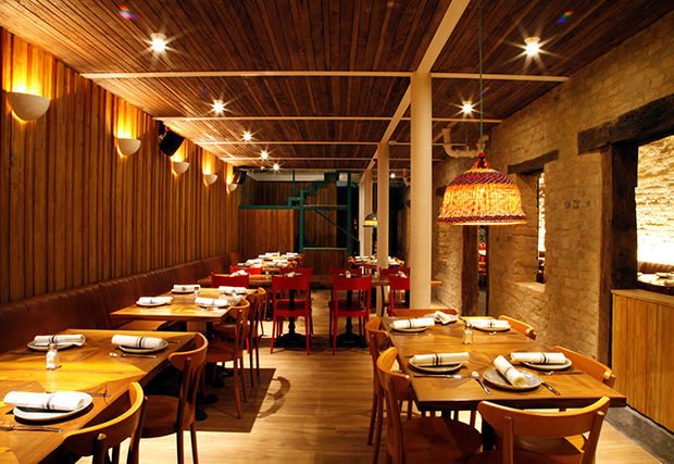
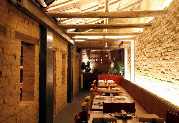
Happy Friday! Today we’re featuring Cantina Y Punto, a Mexican restaurant with some lovely old-school hand-painted elements, and high-end fabric covered menus. The logo looks like it was influenced by Mexican hand-painted signage, with it’s lovely rounded and thick letterforms. The street influence here is upgraded when its foil embossed onto some luxe linen-covered menus, intersecting the urban concept with a touch of class effortlessly.
Cantina Y Punto Branding, Print, and Art Direction by Estudio Indice.


