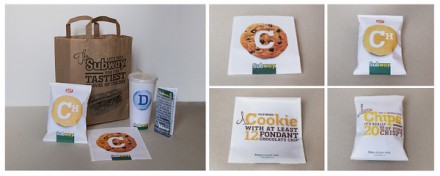
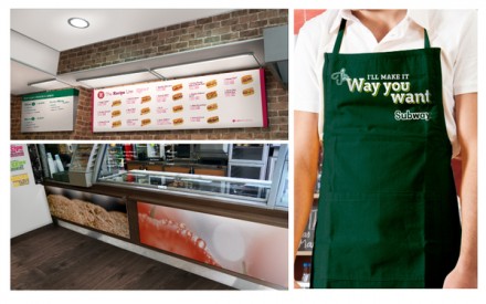
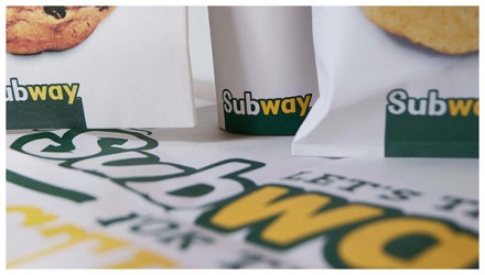
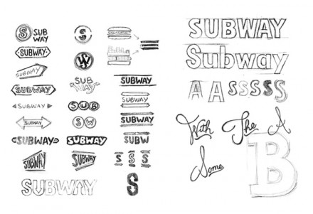
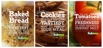
This is a proposed rebranding of the behemoth sandwich franchise Subway, imagined and completed by Adrien Genevard. It’s unlikely we’ll ever see this as the final rebranding should that day ever come, but it’s fun to look at what one creative brandster thinks up for one of the most dominating brands in the business, but a brand that, by all accounts, could stand a little makeover. A couple of things right off the bat:
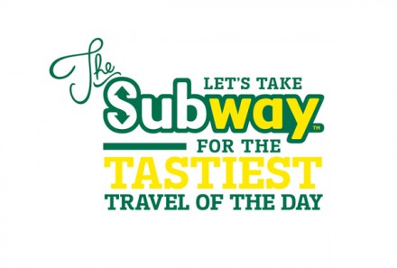
- This shows a wise choice to stick with the original colors and an evolution of the logo. This brand has an existing life of its own and Genevard honors that with his rebrand.
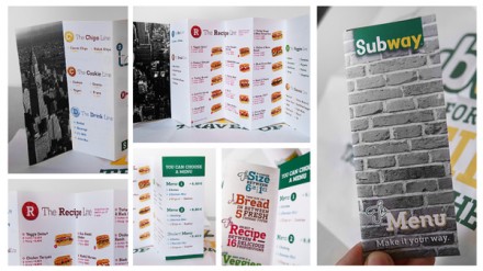
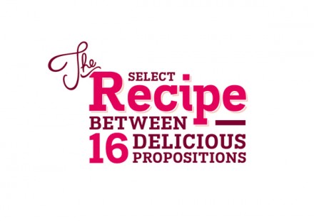
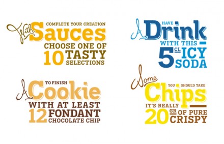
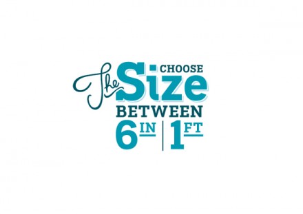
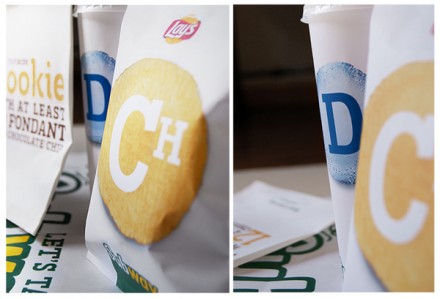
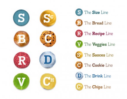
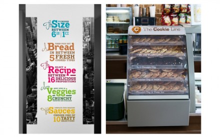
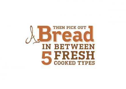
- I love the highlights of the customizable options at Subway. Listing the different sauce choices numerically, the sodas, the chips and on and on. Everything is able to be done your way and I think that’s an idea Subway needs to stick with.
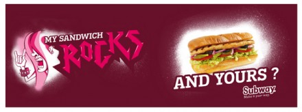
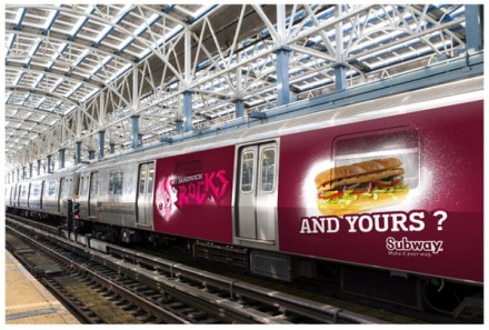
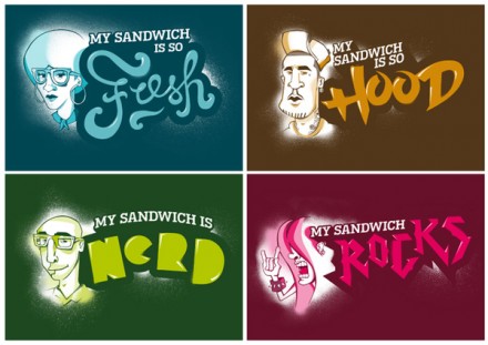
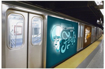
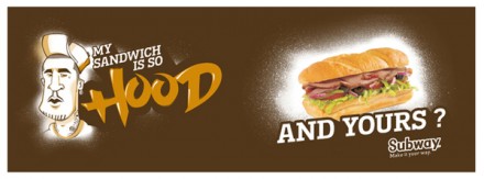
- I like the “My Sandwich Is” campaign. It’s young and hip and gives some personality to a brand that could use some.
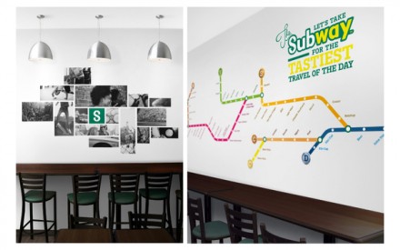
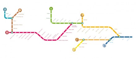
Those are three things I love about this rebranding. I’m happy a subway type of influence is present, but I feel like it’s a little over the top and obvious in some places. The black and white brick background doesn’t work for me, but I do like the use of the Subway map tracks. I think a little more creative use of the subway line influences could be worked in here and it’d be a solid, solid beginning to a rebranding that Subway desperately needs.

