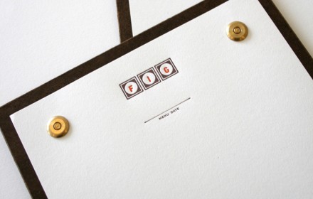
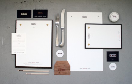
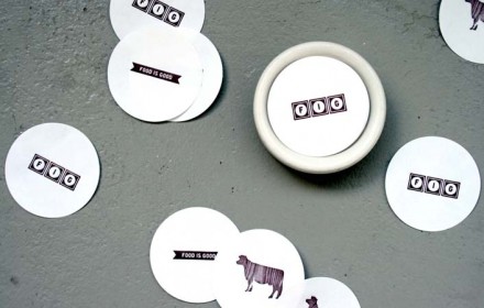
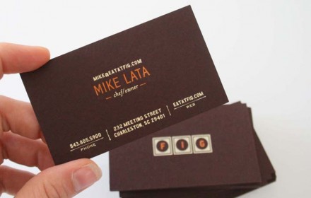
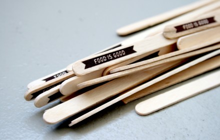
Charleston, South Carolina is another smaller city with a strong restaurant presence. Food Is Good is one of the restaurants there that have embraced the power of good design for their brand. If you’re in the design industry, I’m sure you’ve seen this one pop up in magazines and blogs, but I did want to feature it here for good measure.
The people at Stitch Design Co. put together this identity. It’s simple in its delivery which mimics the style of the cuisine and experience. Simple, but strong. The use of wood textures, real and imitated, enhance the deep dark chocolate color that’s the core of the brand color palate. There is nothing gaudy or over done with the identity. The type and design is allowed to breath letting the content, whether it’s texture or simple composition, do the speaking.
Here’s their description:
A refreshed identity for a restaurant wanting their menus, drink stirs and dining experience to reflect the thoughtful food being served.

