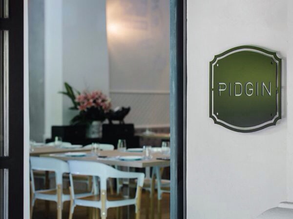
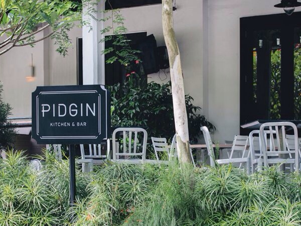
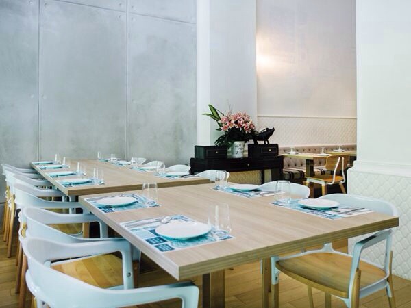
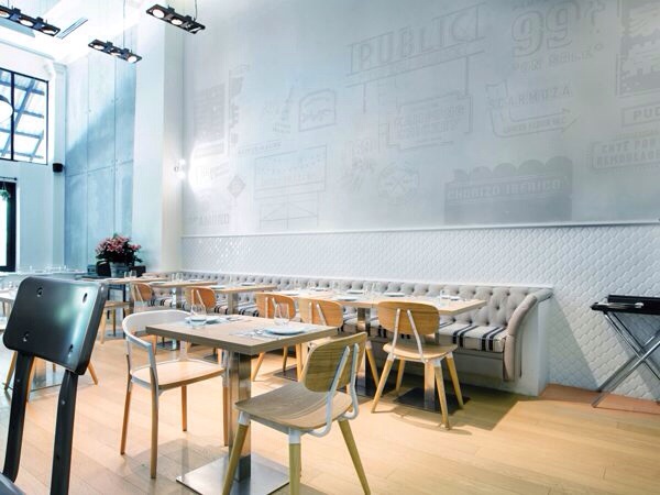
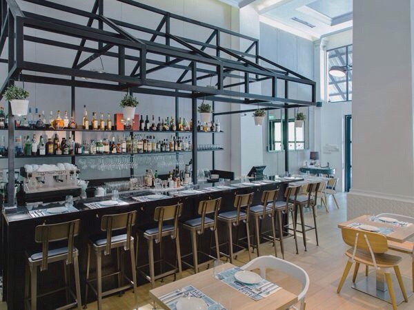
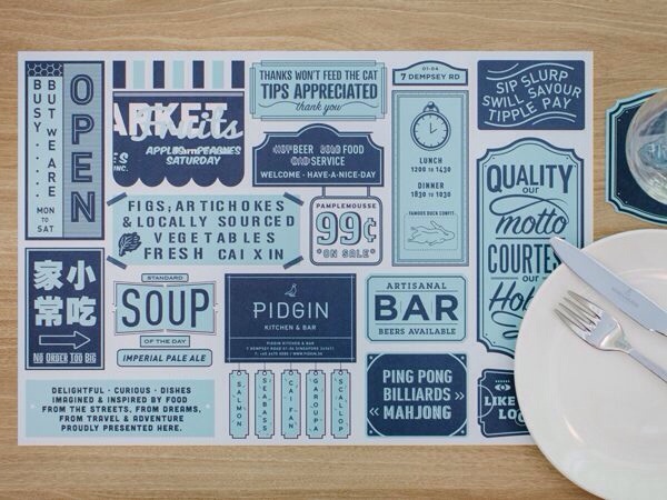
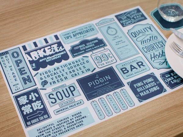
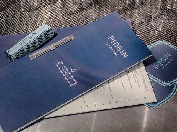
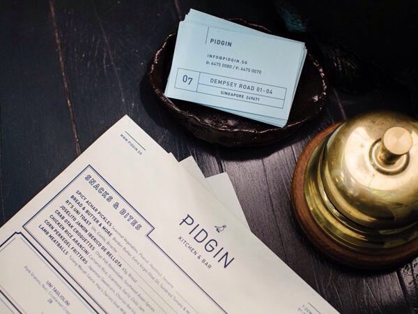
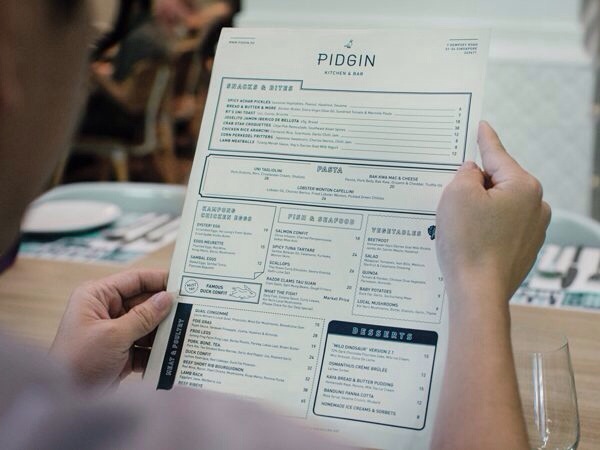
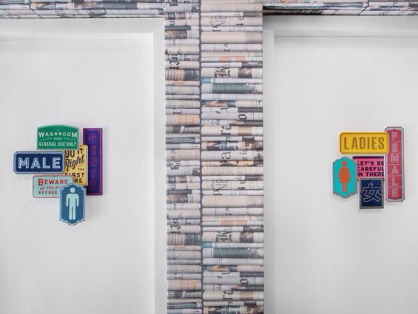
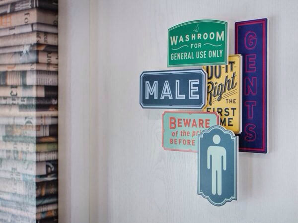
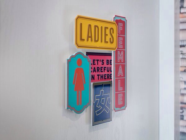
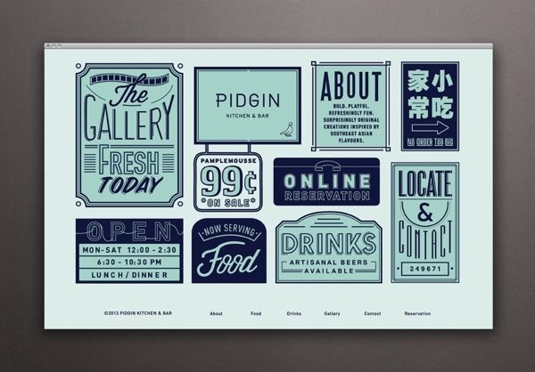
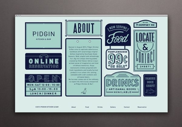
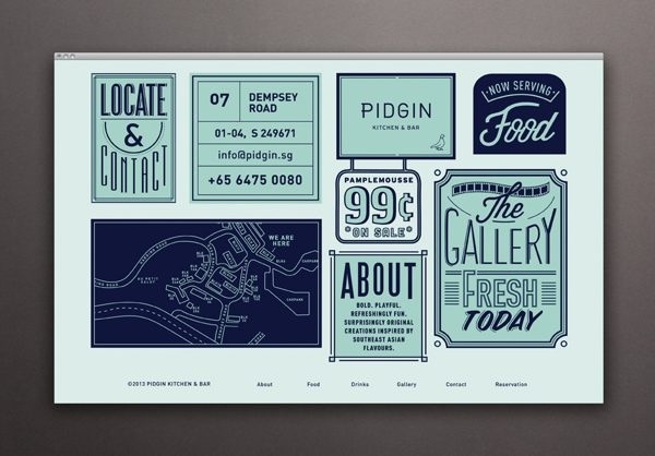
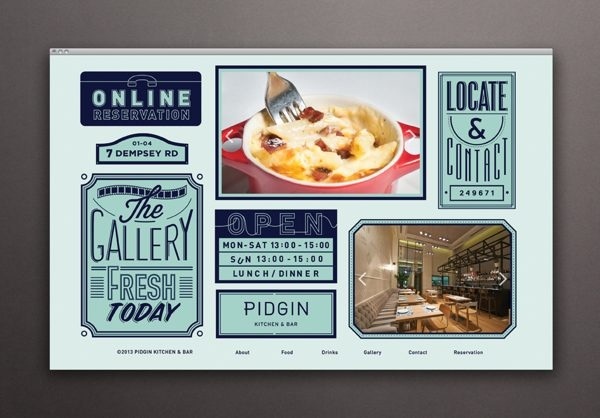
Pidgin is a southeast Asia-based restaurant serving food inspired by the location as well as other gastropub-related menu imaginings. The imaginings is the key because they pull together influences from all over the globe and that directly influences the medley of styles present in this branding. Designers Somewhere Else describes the look as “contemporary with tinges of nostalgia” and I get that. The interior mashes up looks of industrialism, modernism and luxury to create a varied look that is surprisingly warm and inviting. This design mentality is especially evident with the signage on the door to the restrooms. It’s a mix of emblems, icons and statements that all point to the right place. Pidgin accomplishes a really cool and free-flowing vibe with their branding. Cohesion is a challenge with projects like this, but Somewhere Else did an impressive job telling the story of Pidgin. The placemat design is a place where they show a little more of the lighter side of their personality with quirky statements and iconic restaurant signage. There’s a little bit of everything here; it’s cool, relaxed and collected. I like it.

