Restaurant Branding Review: LT Burger

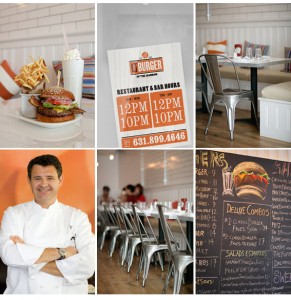
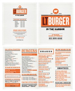
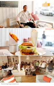
Another burger joint. How can you get sick of these? There’s so much room for fun and unique brand elements. LT Burger was designed by Mark Brooks Graphik Design in Barcelona, Spain. LT operates in Sag Harbor, New York. Out there in Long Island.

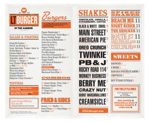
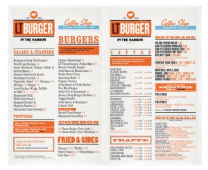
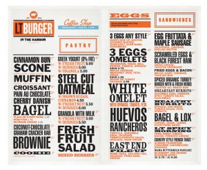
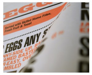
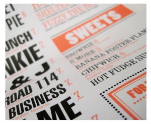
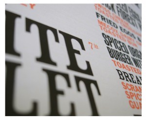
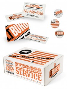
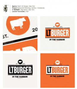
I like the direction Mark took with this one. There are a number of elements happening in the identity that sets LT apart from other burger joints. The vibe is rather clean, sterile in a way, but in a good way. Like they get down to business.

The sterility is deteriorated a bit with a stressed effect. I’m not sure if that’s the best move. It’s one thing to have this happen because of a printing process like screen printing, but I’m not a fan of making it an effect. I think it works well without.

Discuss this Project

Leave a Reply

This site uses Akismet to reduce spam. Learn how your comment data is processed.

The Forktales Podcast™: Interviews with restaurant industry leaders and visionaries

Restaurant and advertising industry headlines and thinking

Reviews of restaurant experiences from around the globe 

Reviews of our favorite design, business, & restaurant books

Our favorite typography and fonts

Inspiration in your inbox

Get the latest inspiration in your inbox every Monday morning, for FREE!

"*" indicates required fields

This field is for validation purposes and should be left unchanged.

Delicious Bits in your Inbox!

Get the latest and greatest content delivered to your inbox for free!

"*" indicates required fields

This field is for validation purposes and should be left unchanged.