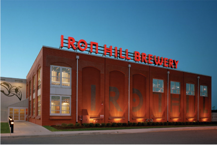
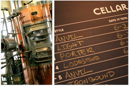
Good ol’ Iron Hill Brewery. I first found this place in Lancaster, PA. The beer is pretty good and the food is even better. Another local brewmaster had said they stayed just a microbrew because it’s impossible to be both a restaurant and make a damn good beer. I beg to differ.
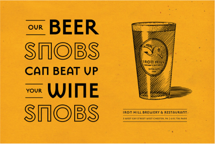
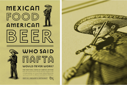
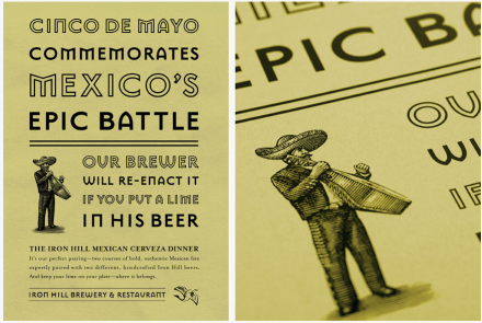
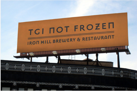
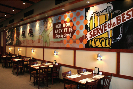
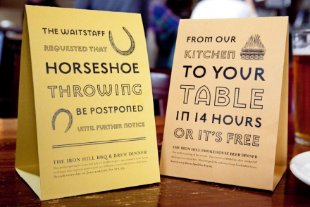
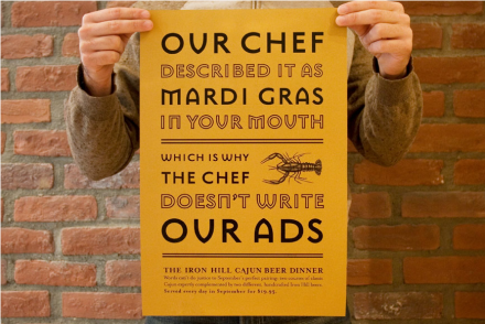
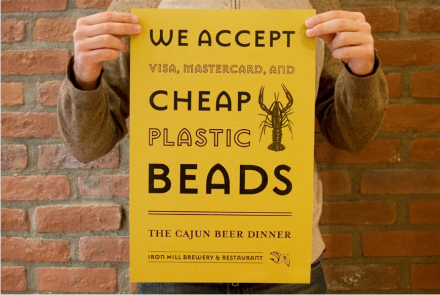
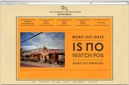
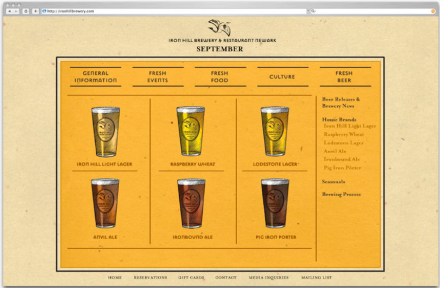
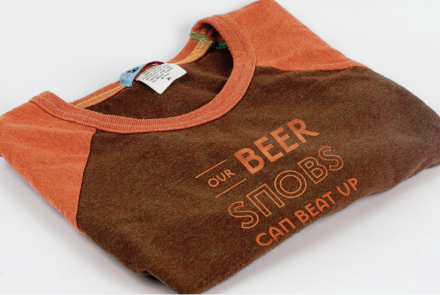
The logo for Iron Hill uses what designers would consider to be a retro typeface as it’s logotype, however, here it works well. The advertising and positioning puts IronHill in a fun, but still laid back voice. I love the puns and copy written for this place.
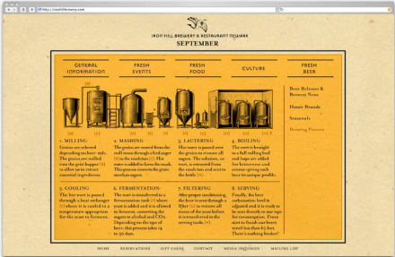
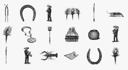
The graphic elements are done in a woodcut style illustration which help support the brand’s vibe, while continuing to build it’s visual repertoire.
Here’s how 160over90, the branding firm behind the design, writes about the project:
Enjoy a full-bodied Lodestone Lager or indulge in a crisp Salmon Spring Roll and you will understand Iron Hill stands for quality. This upscale micro-brew house is quickly becoming a regional powerhouse with multiple locations across the mid-Atlantic region and a slew of medals at the Great American Beer Festival. When it came time to create a brand that was as premium as its product, Iron Hill called on 160over90. Print and in-store executions were supported by broadcast that ran on MTV, ESPN, and CNN.

