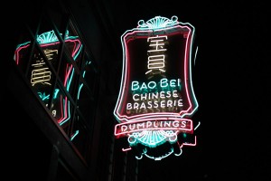
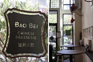
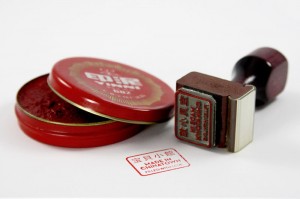
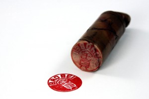
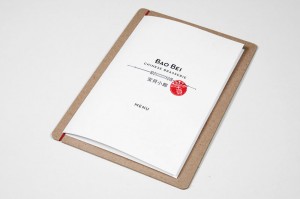
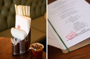
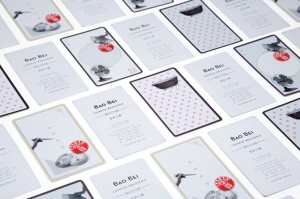
This one is very well done. Kudos to Glasfurd & Walker of Canada for putting together a truly amazing identity. Chinese restaurants are hard to do because they usually fall into a “this is the way we’ve done it, it works, we survive, why change? kind of mode.” Who’s to argue? However, like any genre that gets stagnant like this, it opens the door to do something different, better, eye catching and essentially WINNING (Thanks Mr. Sheen.) Here’s their write up about the work:
Identity and brand design for one of Vancouver’s most anticipated new restaurants – Bao Bei Chinese Brasserie.
The project spanned several months leading up to the official opening in early 2010, and required the studio to design a range of deliverables including multiple signage elements, menus, stationery, various branded products and a simple but effective website.

