The Sullivan Street Bakery brand campaign was put together by Hyperakt in Brooklyn, NY. They briefly talk about their project:
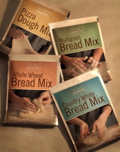
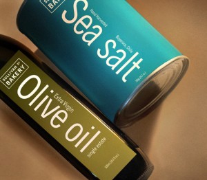
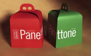
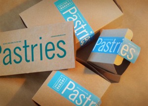
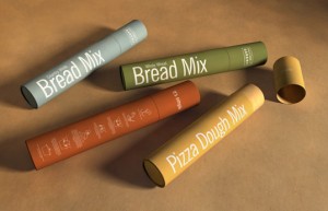
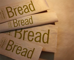
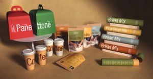
Sullivan Street Bakery makes some of the best bread in New York City. With almost two decades under its belt, it’s a venerable institution in the city’s culinary circles with many top restaurants serving its bread daily. Jim Lahey, the man behind the ovens, is expanding the bakery’s product offerings. He asked us to work in partnership with creative director Greg Crossley on developing a packaging system that would extend the visual language of the bakery across all new and future products.
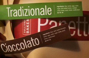
The design is earth with strong typography. The color palate, accentuated by the muted earth tones pops and grabs attention. It’s a true testament to making things interesting without using photography everywhere.

