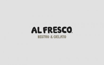
This lovely branding package for a bistro is designed by Anagrama. I love the muted, limited color plate and globby typography. It gives the brand personality without bludgeoning the viewer with expected bright colors. The illustrations are friendly and approachable leaving the viewer with a soft, light-hearted feel. I really dig the symbolic illustrations for the menus too. Very well done.
The Forktales Podcast™: Interviews with restaurant industry leaders and visionaries
Restaurant and advertising industry headlines and thinking
Reviews of restaurant experiences from around the globe
Reviews of our favorite design, business, & restaurant books
Our favorite typography and fonts
Inspiration in your inbox
Get the latest inspiration in your inbox every Monday morning, for FREE!
"*" indicates required fields


2 Responses
The muted tones are an interesting contrast with the illustrations that are full of personality. Very interesting, indeed!
The typeface on the logo is unexpectedly comical. But in a pronounced tasteful way.
I was surprised at the logo’s typography as well, but it plays well with the illustrations.