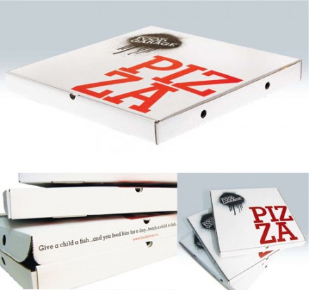
I found this little gem on The Dieline. This identity was pulled together by The Scandinavian Design Group

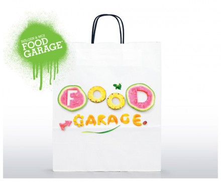
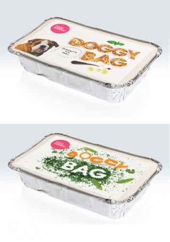
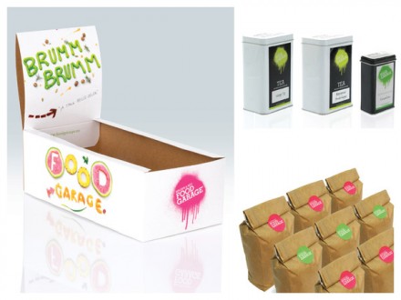
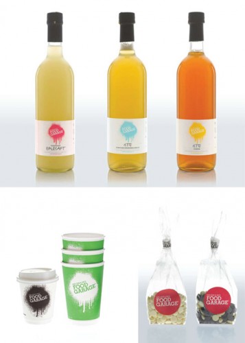
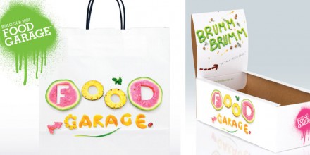
Food Garage was to be Bølgen & Moi’s ultimate food destination offering a deli, take-out service, catering business, bar, restaurant and café. SDG developed a system of creative expression that rocked conventional wisdom on concept, colour, interior design and language – on everything from business cards, teabags and doggy bags to t-shirts and the brand’s website.

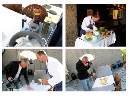
What’s awesome about this branding campaign is that it breaks convention. It’s not something you’d typically see. It’s invigorating and bright. I love the colors and the use of food as typography. The brand identity delivers a message that can be easily reinforced at the location. I’d totally eat here!

Discuss this Project

Leave a Reply

This site uses Akismet to reduce spam. Learn how your comment data is processed.

The Forktales Podcast™: Interviews with restaurant industry leaders and visionaries

Restaurant and advertising industry headlines and thinking

Reviews of restaurant experiences from around the globe 

Reviews of our favorite design, business, & restaurant books

Our favorite typography and fonts

Inspiration in your inbox

Get the latest inspiration in your inbox every Monday morning, for FREE!

"*" indicates required fields

This field is for validation purposes and should be left unchanged.

Delicious Bits in your Inbox!

Get the latest and greatest content delivered to your inbox for free!

"*" indicates required fields

This field is for validation purposes and should be left unchanged.