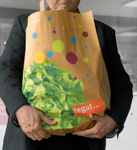
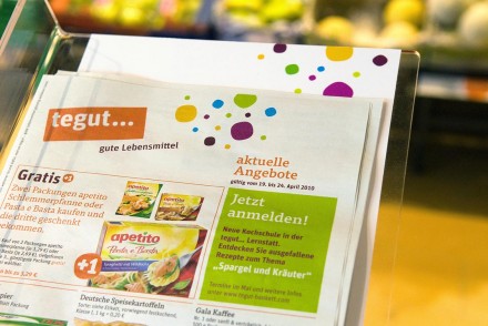
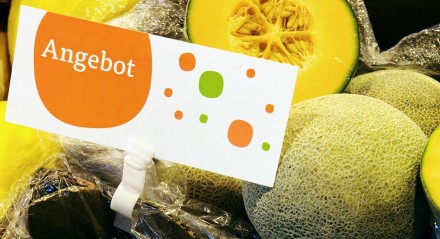
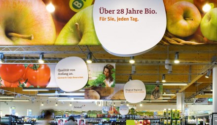
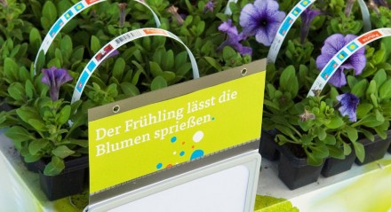
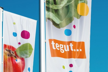
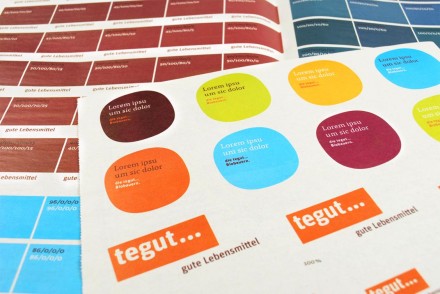
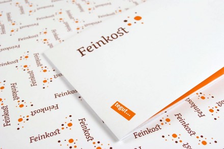
Tegut is a grocery store experience redesigned by EdenSpiekermann. The branding is vibrant and bold with bright colors dancing around the many touch points. The entire experience has had the touch of a designer and it shows. It’s fun. It’s bright. It makes me want to shop here. The wayfinding design is natural and organic reducing stress involved in having to find things. Everything down to the fliers with coupons looks cohesive and pulled together.
To sell good food responsibly – this was the principle Theo Gutberlet had in mind when he opened his first grocery store in 1947. Today the anthroposophic-oriented family business is one of the leading suppliers of healthy foods, with over 300 tegut… outlets.
The house colour remains orange but all other elements of the corporate design have been carefully modernised and express the company philosophy: lively, meaningful, simple. The chief visual element is the superellipse, a figure halfway between a circle and a square, invented by the Danish scientist Piet Hein. In the new markets it creates a cheerful and functional means of orientation and is a unique feature for tegut….
The new look will be introduced in renovated stores starting in mid-March 2010. Edenspiekermann has also designed advertising and printed material, and documents all updates to the corporate design in a style guide.

