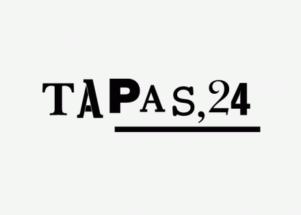
Tapas 24 Restaurant Branding

Tapas 24, designed by Clase BCN, is a tapas bar with a super rustic feel. The restaurant’s identity is driven by rough mix of woodcut style typefaces and highly contrasting colors. It’s one of the few situations where more than 2-3 typefaces can be used in a design. Usually this creates a horrible design feel to a brand, but this is done well and it’s not extended beyond the actual restaurant logo. Here’s how they describe it:

A “tapas” of fonts for the Tapas restaurant, 24 of the Catalan chef Carles Abellán. The essence of the new identity is based on a fresh mix of fonts, icons, and illustrations used in a single color on very basic material, recreating the image of the typical tapas bars of Barceloneta in a contemporary way.


Discuss this Project

Leave a Reply

This site uses Akismet to reduce spam. Learn how your comment data is processed.

The Forktales Podcast™: Interviews with restaurant industry leaders and visionaries

Restaurant and advertising industry headlines and thinking

Reviews of restaurant experiences from around the globe 

Reviews of our favorite design, business, & restaurant books

Our favorite typography and fonts

Inspiration in your inbox

Get the latest inspiration in your inbox every Monday morning, for FREE!

"*" indicates required fields

This field is for validation purposes and should be left unchanged.

Delicious Bits in your Inbox!

Get the latest and greatest content delivered to your inbox for free!

"*" indicates required fields

This field is for validation purposes and should be left unchanged.