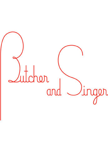
This restaurant identity design comes from Pentagram, and is a wonderful example of art deco style design in a modern brand. I like the color palette a lot as it roots the brand in the traditional and classy. The typography is hand drawn and adds to that vibe. Finally, every piece doesn’t just show the logo, it extends the brand with unique design that build the overall image.


