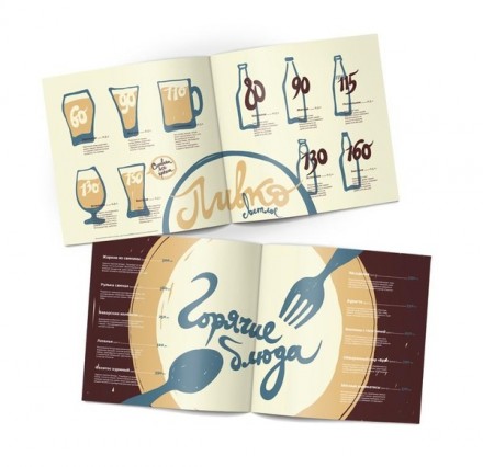
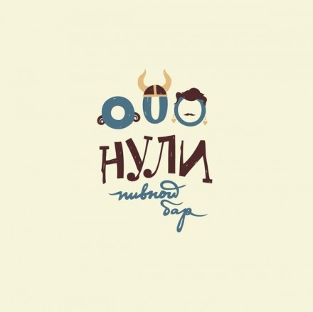
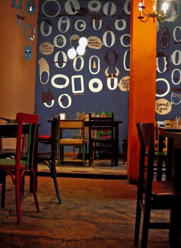
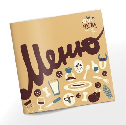
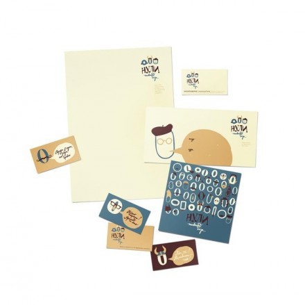
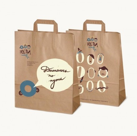
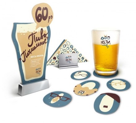
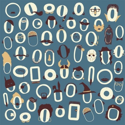
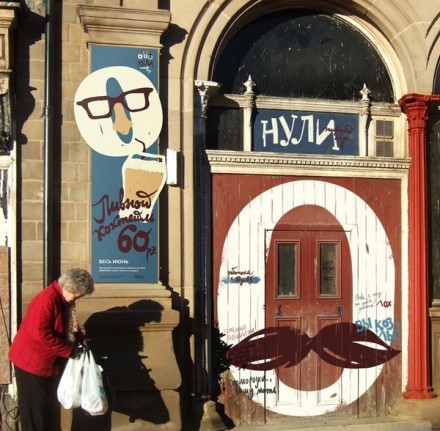
This Russian bar’s identity by Katarina Teterkina is fun, whimsical and definitively inviting. Unfortunately, I have no clue the name of the bar because it is in fact, in Russian. However, you can easily see how she’s tied the brand together with visual cues and accoutrements creating a unified vibe. I like how she’s turned the typography into actual characters using quaint “costumes.” It adds a life to the bar’s brand.

Discuss this Project

Leave a Reply

This site uses Akismet to reduce spam. Learn how your comment data is processed.

The Forktales Podcast™: Interviews with restaurant industry leaders and visionaries

Restaurant and advertising industry headlines and thinking

Reviews of restaurant experiences from around the globe 

Reviews of our favorite design, business, & restaurant books

Our favorite typography and fonts

Inspiration in your inbox

Get the latest inspiration in your inbox every Monday morning, for FREE!

"*" indicates required fields

This field is for validation purposes and should be left unchanged.

Delicious Bits in your Inbox!

Get the latest and greatest content delivered to your inbox for free!

"*" indicates required fields

This field is for validation purposes and should be left unchanged.