Olympic Provisions Branding

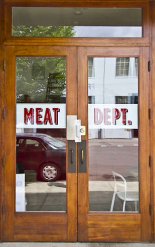
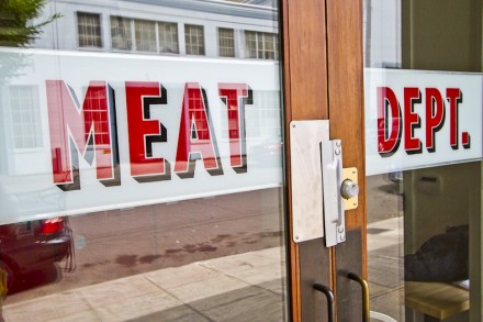
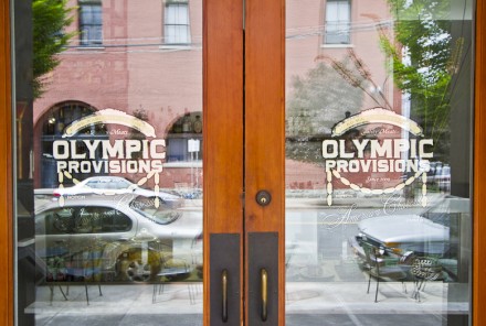
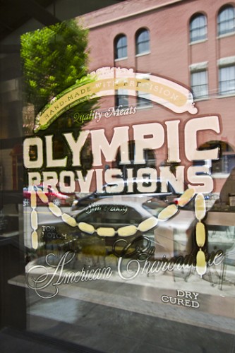
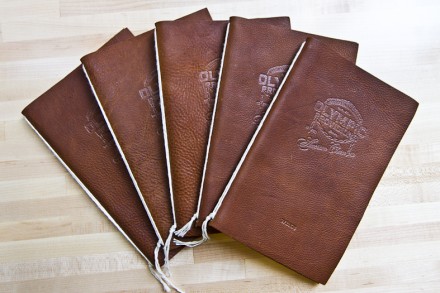
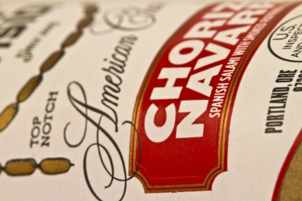
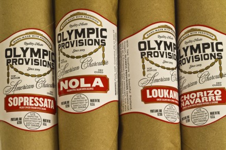
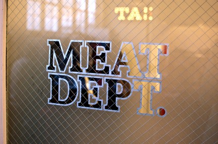
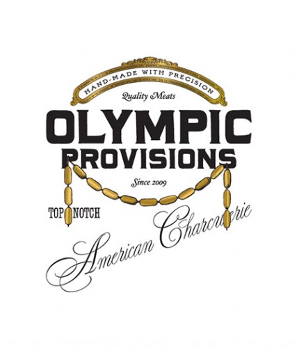
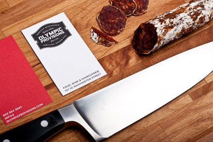
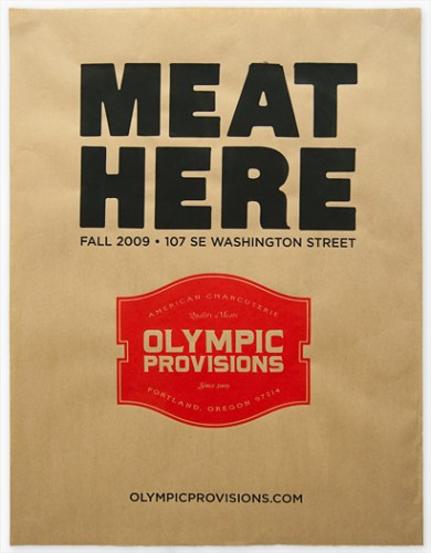
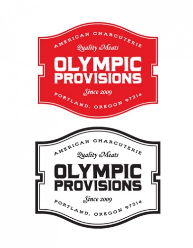
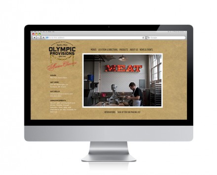
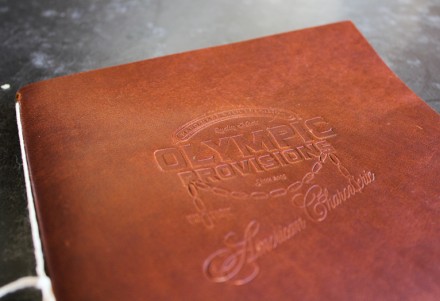
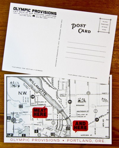
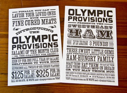
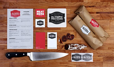
This identity for a charcuterie/butcher can be boiled down to one word: Uber-retro. Olympic Provisions touts a very classic, art deco style that harkens back to the days when butcher shops and chartcuteries were a part of a small town’s offering. These days they’re an asset and a luxury and part of a bigger movement to the trades seen throughout many cities across the nation. The identity is expansive and covers all corners from the cured leather menus to tip-on stickers for the packaging. It’s the little elements here that make this come together so nicely. I’m not a fan of the logo as seen with the hanging sausage, but do love the rest of the heraldry and graphic treatments. Designed by OMFG Co.

Discuss this Project

Leave a Reply

This site uses Akismet to reduce spam. Learn how your comment data is processed.

The Forktales Podcast™: Interviews with restaurant industry leaders and visionaries

Restaurant and advertising industry headlines and thinking

Reviews of restaurant experiences from around the globe 

Reviews of our favorite design, business, & restaurant books

Our favorite typography and fonts

Inspiration in your inbox

Get the latest inspiration in your inbox every Monday morning, for FREE!

"*" indicates required fields

This field is for validation purposes and should be left unchanged.

Delicious Bits in your Inbox!

Get the latest and greatest content delivered to your inbox for free!

"*" indicates required fields

This field is for validation purposes and should be left unchanged.