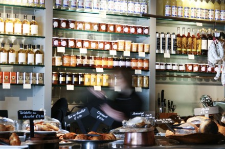
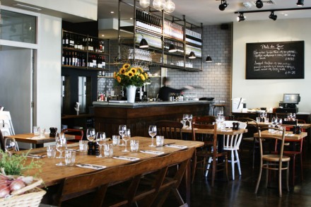
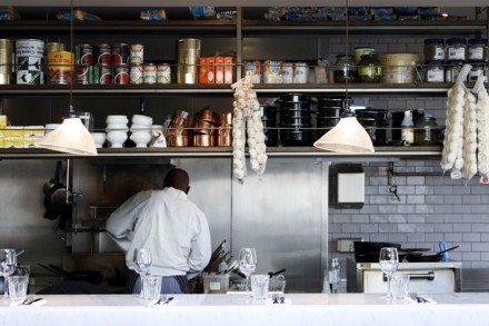
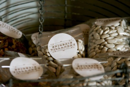
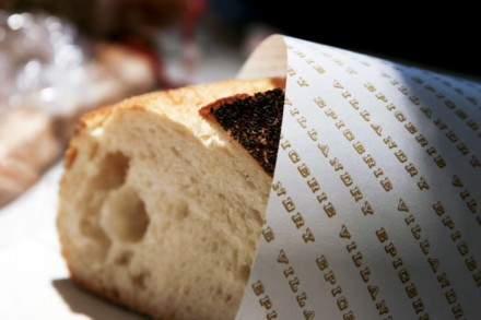
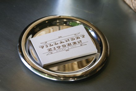
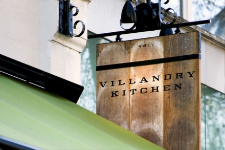
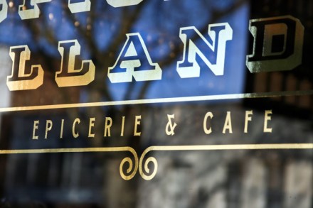
Earthy and simple, the brand identity for Villandry Kitchen uses the textures of natural woods and the products and goods themselves to define their brand. The brand is a culmination of packaging and a kitchen-style restaurant. Everything is clean and simple; easy to read and understand, but it stands out on it’s own as a warm, inviting experience. Designed by Edge & Barrett, they have this to say:
With a food store, bakery, restaurant and bar, Villandry has grown to become a celebrated culinary institution located on Great Portland Street. Edge and Barrett were approached to help extended their gourmet heritage with Villandry Kitchen, a new concept in high street eating and shopping.
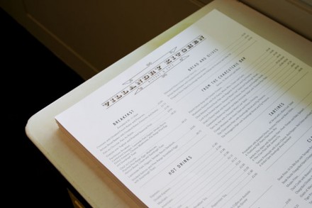
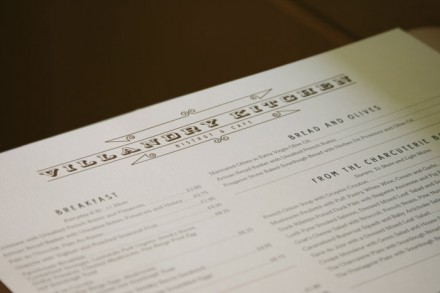
Using Villandry’s history as inspiration, Edge and Barrett designed a heritage led logo with a modern edge that was adaptable enough to be applied to all arms of the business. As well as menu design and other brand literature, we were also involved in creating the interior concept in association with the architects and designing all external signage and marketing material to launch this new venture.



2 Responses
Love your blog. I love your idea of separating your interests into different blogs to keep readers happy. Keep posting http://restaurantsuccessmonthly.com