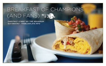
This blue plate special haven in Chattagnooga got my attention when I visited with good friend and artist Fang Ling Lee. I just stumbled upon the design studio that put together the restaurant’s brand identity and am very happy to share. The identity is simple and direct. It’s modern and quaint at the same time. It truly pulls out the style of food delivered by Eat: traditional blue plate special-style cuisine a la The Great Depression era. Designed by Widgets & Stone.

Discuss this Project

Leave a Reply

This site uses Akismet to reduce spam. Learn how your comment data is processed.

The Forktales Podcast™: Interviews with restaurant industry leaders and visionaries

Restaurant and advertising industry headlines and thinking

Reviews of restaurant experiences from around the globe 

Reviews of our favorite design, business, & restaurant books

Our favorite typography and fonts

Inspiration in your inbox

Get the latest inspiration in your inbox every Monday morning, for FREE!

"*" indicates required fields

This field is for validation purposes and should be left unchanged.

Delicious Bits in your Inbox!

Get the latest and greatest content delivered to your inbox for free!

"*" indicates required fields

This field is for validation purposes and should be left unchanged.