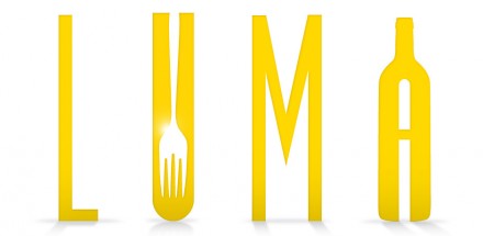
The Luma restaurant brand is marked by use of negative space and graphic representations. The use of whitespace makes each illustration interesting and engaging as your eye dances between the actual shape and the insinuated shapes. The color palette is not my favorite, but it works well for the vibe of the restaurant. I love the way they use die cuts to further the visual effects on the gift card package. Designed by Push

Discuss this Project

Leave a Reply

This site uses Akismet to reduce spam. Learn how your comment data is processed.

The Forktales Podcast™: Interviews with restaurant industry leaders and visionaries

Restaurant and advertising industry headlines and thinking

Reviews of restaurant experiences from around the globe 

Reviews of our favorite design, business, & restaurant books

Our favorite typography and fonts

Inspiration in your inbox

Get the latest inspiration in your inbox every Monday morning, for FREE!

"*" indicates required fields

This field is for validation purposes and should be left unchanged.

Delicious Bits in your Inbox!

Get the latest and greatest content delivered to your inbox for free!

"*" indicates required fields

This field is for validation purposes and should be left unchanged.