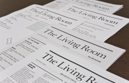
The Living Room Restaurant Branding

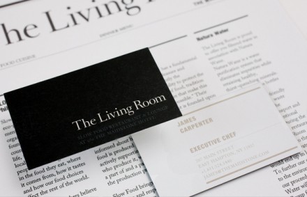
Simple. Clean. Direct. The Living Room Restaurant’s branding is no nonsense and to the point. The typeface is a strong, classic serif type laid out in classic design grid format. Black and white colors make this even stronger with a menu that’s reminiscent of a newspaper. Seems they mean business. Designed by Stag & Hare

Discuss this Project

One Response

Leave a Reply

This site uses Akismet to reduce spam. Learn how your comment data is processed.

The Forktales Podcast™: Interviews with restaurant industry leaders and visionaries

Restaurant and advertising industry headlines and thinking

Reviews of restaurant experiences from around the globe 

Reviews of our favorite design, business, & restaurant books

Our favorite typography and fonts

Inspiration in your inbox

Get the latest inspiration in your inbox every Monday morning, for FREE!

"*" indicates required fields

This field is for validation purposes and should be left unchanged.

Delicious Bits in your Inbox!

Get the latest and greatest content delivered to your inbox for free!

"*" indicates required fields

This field is for validation purposes and should be left unchanged.