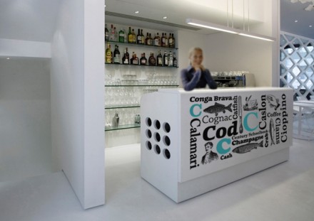
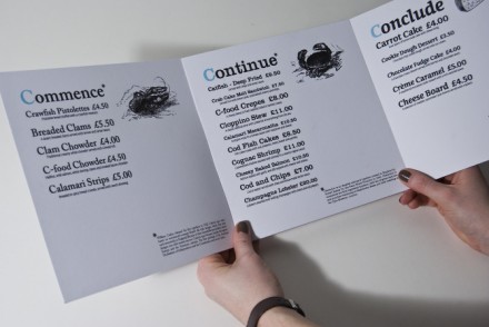
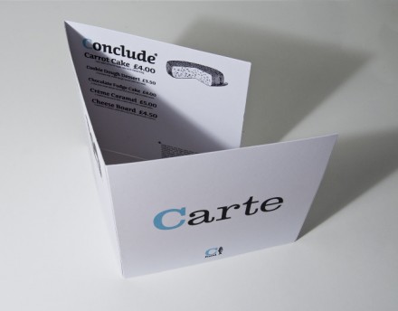
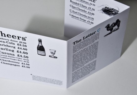
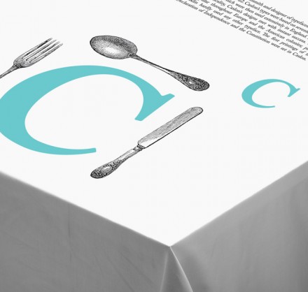
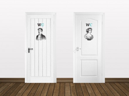
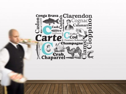
C Food’s brand is supported by a black and white color palette and enlivened with a sea-like color turquoise. The simplistic brand uses illustrations and the letter “C” to drive home the identity throughout the restaurant’s touch points. I like the extra thought put into elements often overlooked, eg. table clothes and bathrooms. Well done by Daniel Waterhouse.


