Costa Chica’s Understated Seafood Branding

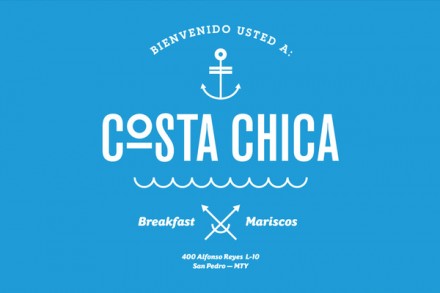
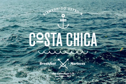
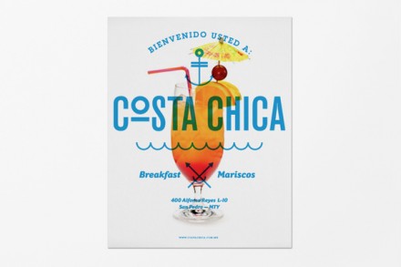
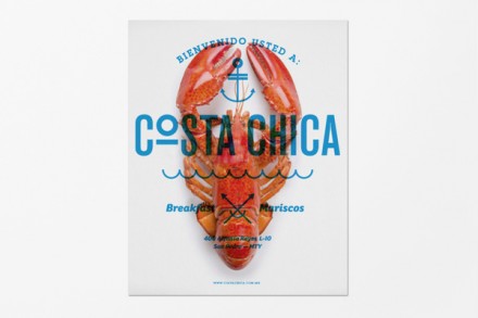
The goal for Savvy Studio in creating the brand for seafood restaurant Costa Chica was to keep the design as simple as the food with a focus on presenting imagery in branding that relates to the freshness with which Costa Chica approaches serving seafood. Using a handful of simple images, Savvy Studio gave Costa Chica an easily-understood meaning centered around the sea and making it readily available to anyone that sits down for a meal at Costa Chica.

5888b79b76245dd6992b642f1be978d5

8937c2f29211a469e6bb4e5fb0d113bc

31979abe73cd4017de2335e2c6120893

9870142813a0e4e6d0020fdea0f9236e

c25788bf2dd68490ca85303267e19909


Discuss this Project

Leave a Reply

This site uses Akismet to reduce spam. Learn how your comment data is processed.

The Forktales Podcast™: Interviews with restaurant industry leaders and visionaries

Restaurant and advertising industry headlines and thinking

Reviews of restaurant experiences from around the globe 

Reviews of our favorite design, business, & restaurant books

Our favorite typography and fonts

Inspiration in your inbox

Get the latest inspiration in your inbox every Monday morning, for FREE!

"*" indicates required fields

This field is for validation purposes and should be left unchanged.

Delicious Bits in your Inbox!

Get the latest and greatest content delivered to your inbox for free!

"*" indicates required fields

This field is for validation purposes and should be left unchanged.