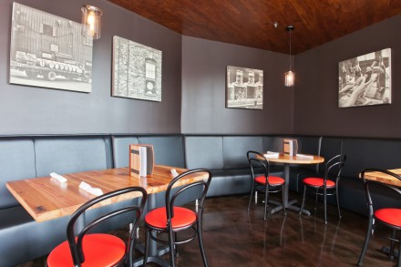
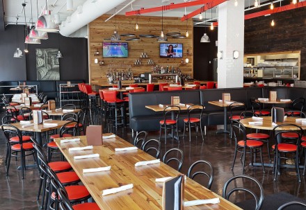
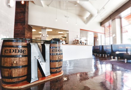
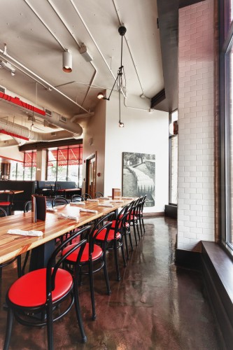
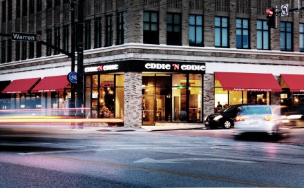
It’s impossible to create a restaurant that combines bourbon, apple pie and burgers and not find ways to draw inspiration from America. Leaving out America in a brand based on these items is like Christmas without Santa Claus. Louis+Partners did the branding, interior design and architecture for the Lakewood, Ohio burger place and themes of Americana pop up all over. Using cost-sensitive design aesthetics, L+P created a hip and modern space with touches of the last century throughout. Simple seating solutions, a color scheme that pops and glossy wooden tables make every guest feel at home before they’ve even tried the food.
The Forktales Podcast™: Interviews with restaurant industry leaders and visionaries
Restaurant and advertising industry headlines and thinking
Reviews of restaurant experiences from around the globe
Reviews of our favorite design, business, & restaurant books
Our favorite typography and fonts
Inspiration in your inbox
Get the latest inspiration in your inbox every Monday morning, for FREE!
"*" indicates required fields


