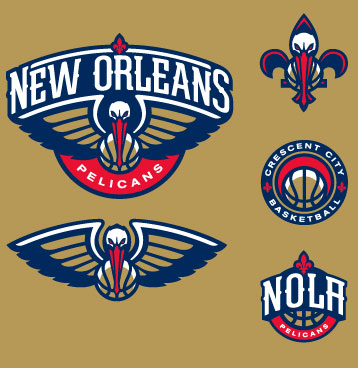
The Charlotte Hornets moved to New Orleans in 2002 and kept the Hornets brand until this past offseason. They introduced a name change to the Pelicans in December of last year and shortly after unveiled the entire rebranding concept. Imagined by RARE Design, the team takes the name of the Pelicans, the state bird, and the name also gives a nod to the Gulf coast region, an environment the city of New Orleans is actively working to protect. It’s also an environment in which the pelican thrives. The color scheme changes from the Hornets’ teal, purple, gold and white to a more New Orleans-centric blue, gold and red. The logo works because it includes so many elements of New Orleans including the fleur-de-lis. As is the case with most sports team logos, the images needed to look imposing as well and while the pelican is far from an intimidating bird, RARE did an excellent job in creating a menacing-looking pelican to constitute the rebranding efforts. RARE had previously helped NBA franchises like the Miami Heat and Dallas Mavericks create successful rebranding campaigns.