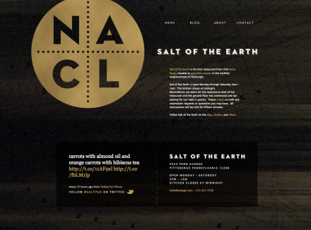
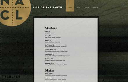
Salt of the Earth is one of Pittsburgh’s favorite restaurants. The modern gastropub is a pretension-free zone, with a stripped-down interior that asks the guests to focus strictly on the food. Full Stop Interactive helped Salt of the Earth develop their brand identity as well as their website. The most striking aspect of the identity is the logo with its metal appearance and NaCl, the chemistry formula for sodium chloride, also known as salt. The use of black with a metal sheen reflects the stark elements of the restaurant and its philosophy. It’s also a slight reference to the steel that built Pittsburgh, an aspect that is as much a part of the fabric of the city as anything. In a time when ideas pitched for restaurant branding involve a lot of moving parts and hip notions, Salt of the Earth and Full Stop Interactive kept things simple and nailed the subdued and serious-about-the-food atmosphere of the place.
The Forktales Podcast™: Interviews with restaurant industry leaders and visionaries
Restaurant and advertising industry headlines and thinking
Reviews of restaurant experiences from around the globe
Reviews of our favorite design, business, & restaurant books
Our favorite typography and fonts
Inspiration in your inbox
Get the latest inspiration in your inbox every Monday morning, for FREE!
"*" indicates required fields


