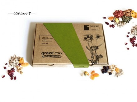
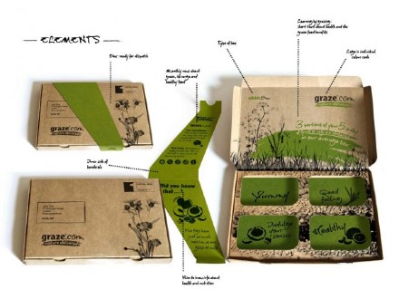
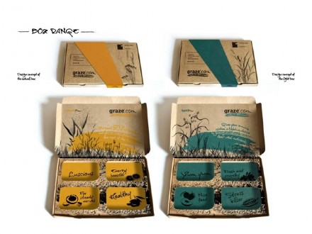
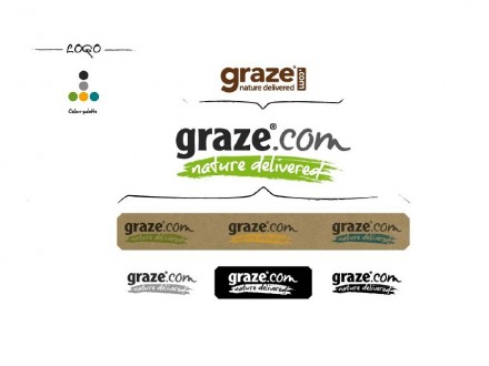
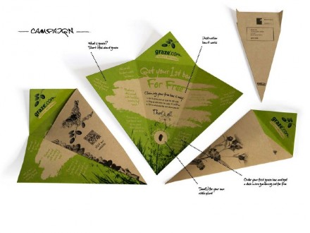
Snacks don’t have to be designed, branded and marketed with kids in mind. Graze.com offers fresh-fruit snacks through the mail using special packaging they’ve developed. A brilliant idea deserves brilliant design and Susanne Klosz from Suena gave Graze something to be proud of. Last year Klosz redesigned the box and the logo for Graze and the result is a friendly package not unlike the fancy deliveries of cheese our parents used to get back in the 80’s. It symbolizes a rare treat delivered through the mail, but it goes well beyond that. It’s a calm identity and design that emphasizes the wholesomeness and natural aspects of what Graze delivers to your mailbox.
The Forktales Podcast™: Interviews with restaurant industry leaders and visionaries
Restaurant and advertising industry headlines and thinking
Reviews of restaurant experiences from around the globe
Reviews of our favorite design, business, & restaurant books
Our favorite typography and fonts
Inspiration in your inbox
Get the latest inspiration in your inbox every Monday morning, for FREE!
"*" indicates required fields

