Discreet Southern Branding For Mama Joy’s

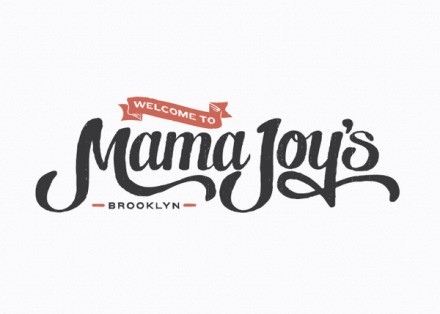
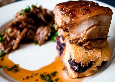
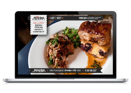
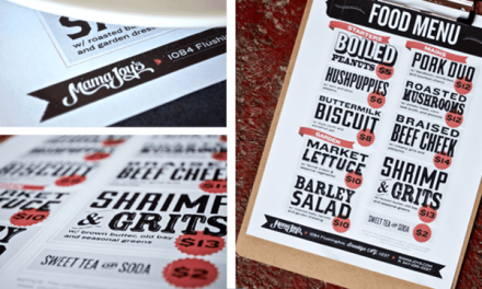
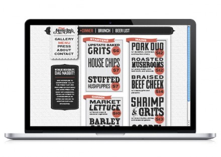
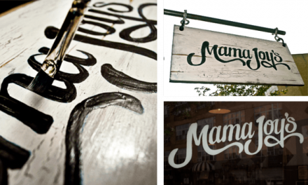
Brooklyn based Mama Joy’s required an intrepid look that showcased their Southern cooking style but wasn’t too homey, hokey or humble. Using hand-painted touches around the interiors of the restaurant combined with the script of the logo, No Entry Design accomplished a DIY look that is welcoming and warm, but without the antique and wood look often associated with such characteristics and style. The “Welcome to” banner within the logo is repeated throughout the printed materials, specifically on the menu to highlight certain specials or dishes of note. The results of the branding are discreet and unimposing, not quite like the food, but gets the job done.

db68bc5202228b4262399d236290f02d


4e39894db59ece8d773fbc4e57ce7c45

8c436c2fe6514176a9a74204215667c8

7376c382a3680d9ce29c740abdfc69a7

579200a7d7f708cdd80032df30dc0ef6

603352b0260d24c53a35a59f01b85ed8

aee82e77da2501f0394ce671df3c7c60

cdbd3be726cb48d227e0115386b4d5ee


Discuss this Project

Leave a Reply

This site uses Akismet to reduce spam. Learn how your comment data is processed.

The Forktales Podcast™: Interviews with restaurant industry leaders and visionaries

Restaurant and advertising industry headlines and thinking

Reviews of restaurant experiences from around the globe 

Reviews of our favorite design, business, & restaurant books

Our favorite typography and fonts

Inspiration in your inbox

Get the latest inspiration in your inbox every Monday morning, for FREE!

"*" indicates required fields

This field is for validation purposes and should be left unchanged.

Delicious Bits in your Inbox!

Get the latest and greatest content delivered to your inbox for free!

"*" indicates required fields

This field is for validation purposes and should be left unchanged.