Simple, Efficient & Effective Branding

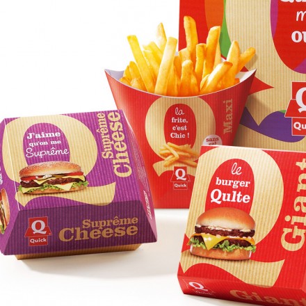
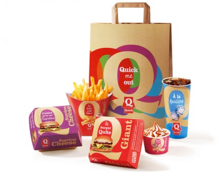
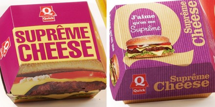
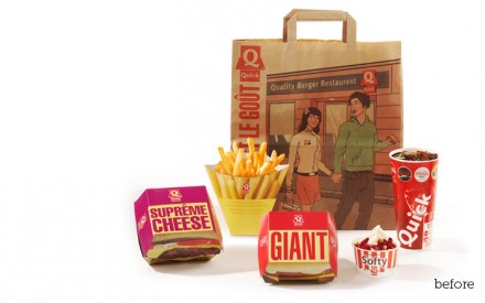
It was 2006 and Quick needed a brand renovation.  One of the top fast-food stops in Europe (No. 2 in France and No. 3 in all of Europe) wanted to step their game up and push for the top spot among all fast-food chains on the continent. They may struggle to overtake McDonald’s, but they can still throw their weight around in the market. Blackandgold led the way for Quick with a rebranding, changing the packaging of the products into a more updated color scheme and presentation. The key to the rebranding of Quick was to make the Q more prominent and allow it to stand on its own as an iconic symbol of the company. The overall design of the materials is clutter-free and simple, but it remains appealing, pleasing and unmistakably Quick. With the brand updated to a smarter and more appealing image, Quick would go on to present such creative ideas as the “Dark Vador” burger to the French marketplace.

 

1_2_12_quick

1_2_12_quick1


1_2_12_quick2

1_2_12_quick3

Discuss this Project

Leave a Reply

This site uses Akismet to reduce spam. Learn how your comment data is processed.

The Forktales Podcast™: Interviews with restaurant industry leaders and visionaries

Restaurant and advertising industry headlines and thinking

Reviews of restaurant experiences from around the globe 

Reviews of our favorite design, business, & restaurant books

Our favorite typography and fonts

Inspiration in your inbox

Get the latest inspiration in your inbox every Monday morning, for FREE!

"*" indicates required fields

This field is for validation purposes and should be left unchanged.

Delicious Bits in your Inbox!

Get the latest and greatest content delivered to your inbox for free!

"*" indicates required fields

This field is for validation purposes and should be left unchanged.