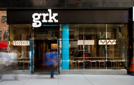
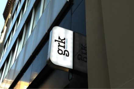
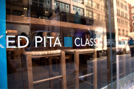
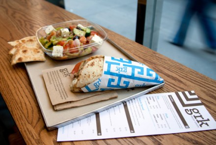
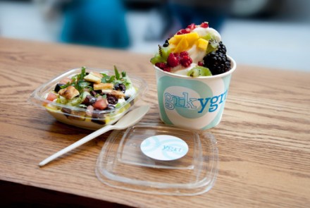
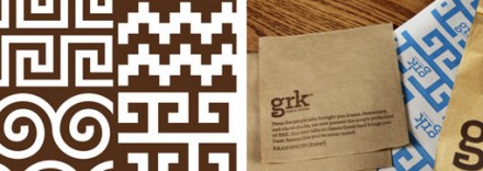
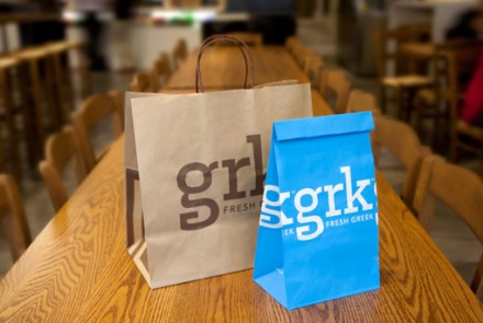
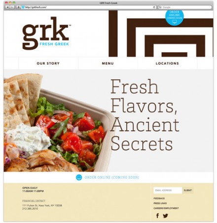
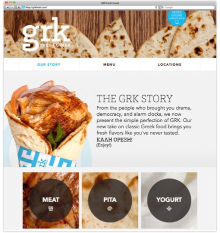
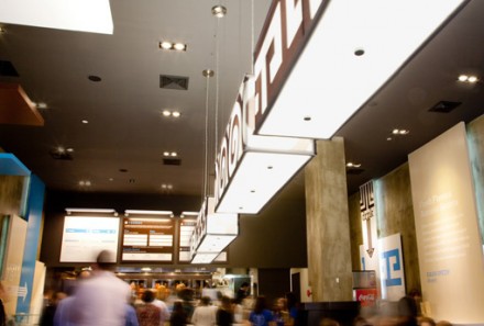
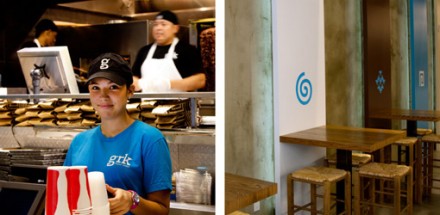
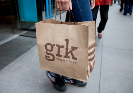
The branding for New York’s GRK needed to look like what the restaurant pitches to its potential customers: an authentic and high-quality Greek joint. That’s GRK in a nutshell, but they’re a little different. While their heart may live in the age-old Greek cuisine practices that produce delicious yeeros and salads, their style is modern and they wanted a brand vibe from the top down that said all of this. No architectural columns or photos of the sea in this location. While that may have been an obvious choice, GRK turned to Red Antler to help them round out their branding and the firm delivered an image awash in Mediterranean blues and rich browns. GRK uses numerous photos of their food as part of their branding and they’re designed well so they look mouthwatering. One central aspect of the design that has roots in Greek food culture but is a fresh idea in its own right is the reoccurring diagonals and edges used in the logo, etc. This is a smart nod to the iconic “New York Coffee Cup”. A new take on classic flavors is what GRK says they promise and their branding works well to reflect it.
The Forktales Podcast™: Interviews with restaurant industry leaders and visionaries
Restaurant and advertising industry headlines and thinking
Reviews of restaurant experiences from around the globe
Reviews of our favorite design, business, & restaurant books
Our favorite typography and fonts
Inspiration in your inbox
Get the latest inspiration in your inbox every Monday morning, for FREE!
"*" indicates required fields

