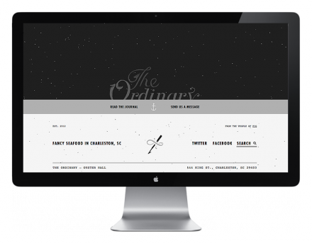
What started out as an initial logo for The Ordinary while other aspects of the brand were resolved became the Charleston, South Carolina’s seafood place’s regular handle. The Ordinary, teamed with brandsters Fuzzco, decided to further develop the already-existing buzz of the restaurant and start a Facebook page to promote the upcoming restaurant. They used a simple black & white scheme, with accents of gray. The typeface has a fairy-tale feel and set against the starry-skied black backdrop, it gives the brand a comic book fantasy appeal that is really alluring. It’s all very elegantly simple, but Fuzzco used whimsical touches to keep it light and not-so-serious. It’s imaginative and thoughtful and perfect for a place that had fans before the door opened. Since the doors have opened, the original became the mainstay for The Ordinary.


