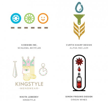
Bill Gardner at Logo Lounge just released his annual logo trends report and much of what he covers in the article has shown up a lot lately in the Invigor8 blog. Gardner identifies a handful of trends that you’ve very likely seen quite a bit of lately if you keep your eyes on the logo branding that is happening all around you. Some of what Gardner covers includes the now-iconic here pin, badges and banners, waves, molecular imagery and visual formulas. Gardner reminds us all that clichés are such for a reason (they usually work) and that bit of feedback right from the top is important sometimes for creatives to remember as they attempt to create something glowing for a client. Clichés need their own spin to stand alone, but the trends are present for a reason and understanding why they’re popular and why they work can help anyone working in branding see the benefit of something that is working for many clients. Going with a trend doesn’t make you a sell out, it makes you smart for recognizing a trend and using it to your full advantage. Clients may not always know the trends, but they can spot something that is fashionable (for lack of a better word) and that usually works for them.
One of my favorite examples that Gardner provides is that of the formula in branding. Formula brand marks work because they show the ingredients of what a business is providing. Formulas give the viewer a sense of sequence, simplicity and ease. There’s nothing to understand about the business because the logo spells it all out in a visually appealing series of images that fit the company like a glove. It’s engaging and educational and that’s really what you want from a brand.
The banner trend was highlighted most recently on this blog with Sweet Chick, a Brooklyn fried chicken joint. Sweet Chick’s banner, laying on top of the chicken image, ties the brand mark together with the necessary words to accompany the image. The banner acts like a bow, bringing it all together.
The line craft trend showed up here in the brand review of Abi-Haus and like Gardner says, the understated elegance of the logo creates a vintage vibe without relying on too many cliched vintage elements. Of course earlier I said clichés work, but they can also be dangerous. However, they can work out wonderfully when you stick to one trending cliché and dress up the rest of a brand mark with creative measures influenced directly from the brand. These are a just a few examples of restaurant branding reviews we’ve done recently that feature some of the trends Gardner describes.
One parting shot from Gardner regarding trends and logo work in general: approachable is always a good way to go in logo design, but maintaining a genuine vibe is priority No. 1. Trends mean nothing if the brand vibe you create for a client is uninspired.


