
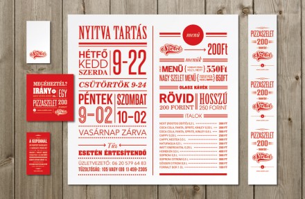
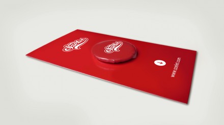
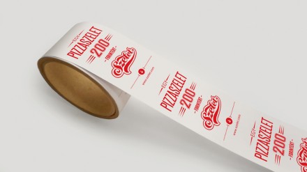
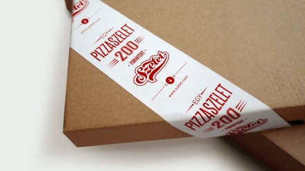
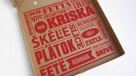
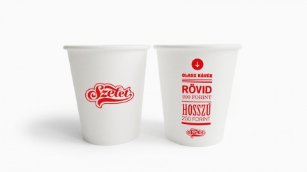
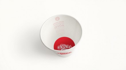
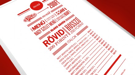
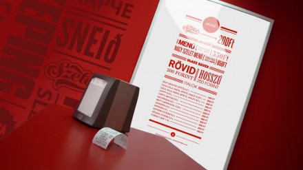
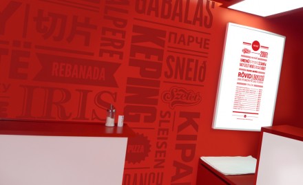
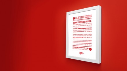
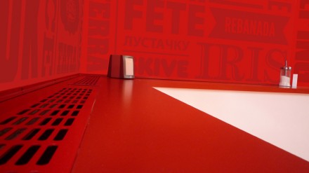
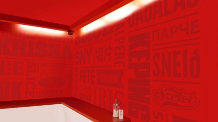
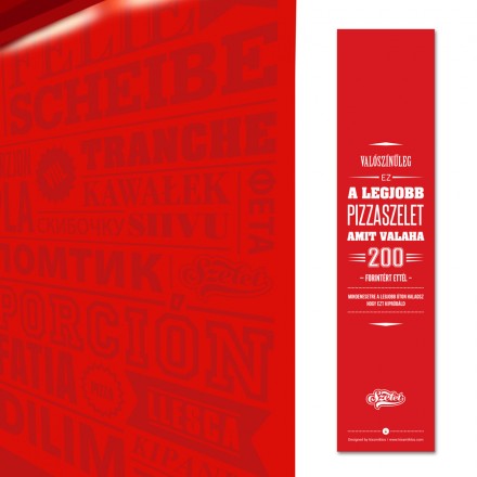
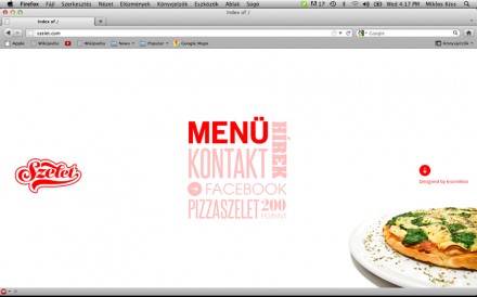
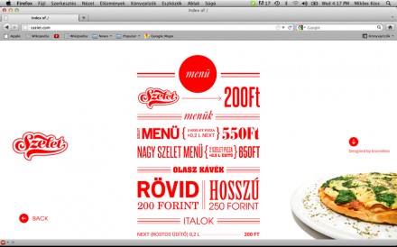
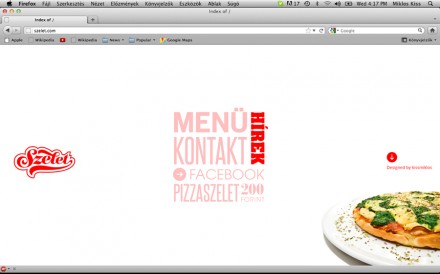
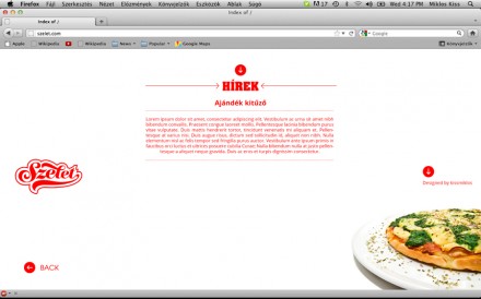
In Budapest, there’s a pizza joint named Szelet. The full branding was completed by Kiss Miklos and what he accomplished is a straight-forward and clean branding effort that provides a lot of punch with very little unnecessary swings and misses. Miklos started with the name, one he came up with that means “slice” in English. The simplicity of the job comes from the simple approach Szelet takes to what they do. Their specialty is a simple slice, nothing less or more. The logo has traditional pizzeria elements, including the iconic tail underscoring the logo. Everything is done in red, a close association to the pizza itself and the roundness of the logo also alludes to the pizza. The branding is word-heavy, using a bold typeface to explain everything about the brand. The interiors are a borderline overwhelming red, but it’s balanced nicely with the shots of white throughout. One key about Miklos design is its ability to be reproduced as part of a repeatable franchise. The entire brand is straight and to the point and that’s why it works.


 Sz
Sz


