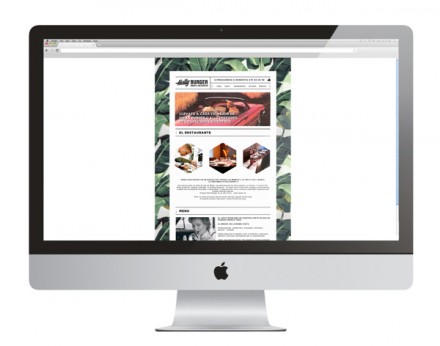
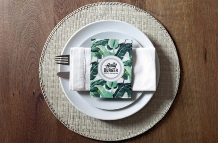
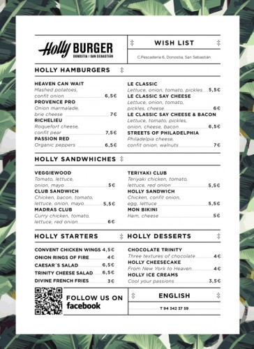
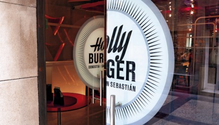
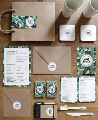
Nestled in the north of Spain is a burger restaurant named Holly Burger. The owner’s aunt is Holly and she’s the one to thank for Holly Burger’s secret burger recipes. Holly’s branding was designed by Rodrigo Aguadé and Manuel Astorga and they wanted an American-style brand with some seriously vintage inspirations. They didn’t just strive to have aesthetically similar branding to American styles, they wanted it to have an American vacation feel so they turned to 70’s-style wallpaper and found further inspiration in the window prints in old-fashioned American clothing stores. Americans have the market cornered on burgers, so it’s smart positioning for Holly Burger to allow some American characteristics into their branding, though some of their customers may never set foot inside the states. This inspired design is clean, fresh and unpretentious, a nice look for a burger joint in one of the most beautiful places in the world.

8cbb44049fe5831887d595d43df427d2

0bf0da91335013a0507a4b4c6ef0dfa0

1f3afbd58d7b979f3c558ce4d843977a

3ac54b4b22a1bd4951435e249eb607bc

4ad1502d9c723b862d134f716a652ec5

305bc17a0c50dc6f586e331ad0aad2ac


Discuss this Project

Leave a Reply

This site uses Akismet to reduce spam. Learn how your comment data is processed.

The Forktales Podcast™: Interviews with restaurant industry leaders and visionaries

Restaurant and advertising industry headlines and thinking

Reviews of restaurant experiences from around the globe 

Reviews of our favorite design, business, & restaurant books

Our favorite typography and fonts

Inspiration in your inbox

Get the latest inspiration in your inbox every Monday morning, for FREE!

"*" indicates required fields

This field is for validation purposes and should be left unchanged.

Delicious Bits in your Inbox!

Get the latest and greatest content delivered to your inbox for free!

"*" indicates required fields

This field is for validation purposes and should be left unchanged.