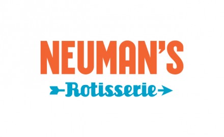
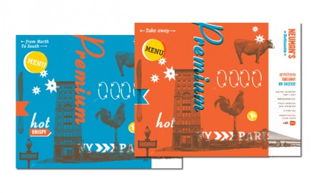
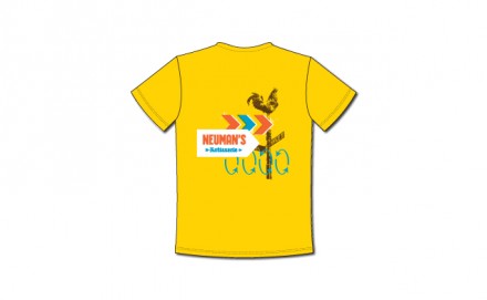
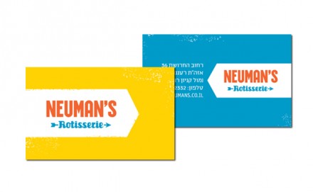
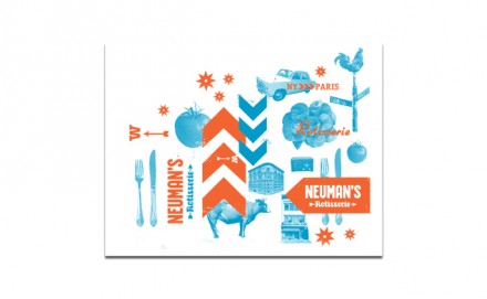
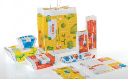
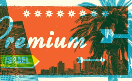
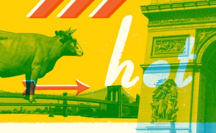
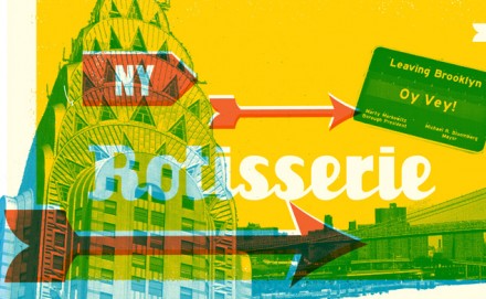
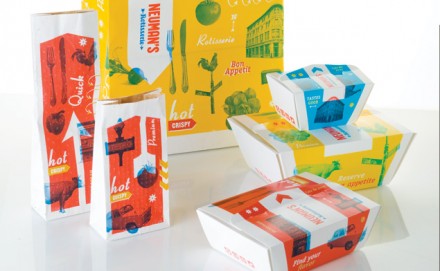
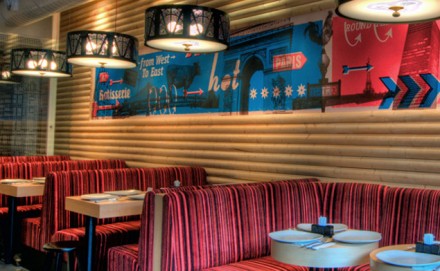
Like we established in yesterday’s post on logo trends, a trendy logo is nothing without inspiration behind it. A logo that looks flashy, trendy and modern is like an empty promise if it doesn’t have aspects of the true culture and vibe of the brand attached to it. In his column, Gardner from Logo Lounge points out a new trend in logo creation: the navigation pin that is most familiar to you because of its use in GPS systems. That particular trend signifies an arrival or the feeling that the brand’s sense of place is strong and necessary. The use of arrows can also do this, but that’s a cliché that can sometimes be avoided. The branding of Neuman’s by Yotam Bezalel doesn’t avoid the use of the arrow, and in this case it works well. Neuman’s Rotisserie is a fine example of taking a cliché and making it work with the proper inspiration. Yotam Bezalel was tasked with creating the branding for Neuman’s, an Israel-based rotisserie diner. They strived to create a look that married French and American aesthetics because that’s what the owners did. An American man fell in love with a French woman in Paris and the couple went on to form Neuman’s and their love story of competing nationalities served as the foundation for the branding of Neuman’s. The restaurant blends the fast-casual style of American fast food with the sophistication of French dining. The arrows used in the Neuman’s branding are inspired by the weathervane and its relationship with chickens, the primary ingredient in what Neuman’s offers. The weathervane also has a special place in French style in addition to the place arrows occupy in pop culture imagery and the pops of color throughout the brand job finish off the American vibe. Neuman’s branding shows what happens when brand makers take risks with elements that aren’t new, but can be twisted to tell an original tale of the food that ends up on your plate.

