An American Pastelería In Spain

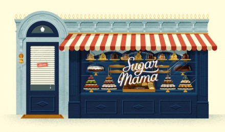
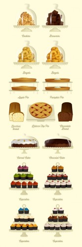
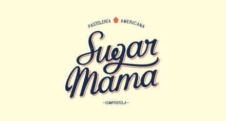
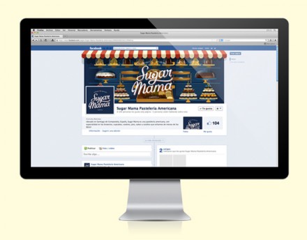
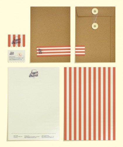
Sugar Mama is an American pastry shop in Spain, which kind of sounds like the opening line to a premise about a movie set in Spain for American viewers. David Sierra did the branding for this project and it emerges with a well-balanced Spanish-American feel. The red and white stripes that appear in some of the packaging and on the exterior of the store front is one instance where the design scheme crosses over into an influence from each country. The logo itself is relatively simple, a cursive script with the tag of the g underscoring the last half of the word “Sugar”. The typeface has that mama feel, essential to a place like this. The branding is relatively simple in general and I think that less-is-more approach works well here. Bakeries can be some of the most decadent places on Earth. If the treats are good, the deets don’t matter.

5d7148236b1a550463cb15162cd9e40f

0a6049ba78da54681387d78a15bcbe19


5fd5fee4f732e5dca07bad6ff5667a5e

b0daf2a08196ad1a746a3f7659c3a085

c39aa749e71a32a7d082aff96f8ddeaa


Discuss this Project

Leave a Reply

This site uses Akismet to reduce spam. Learn how your comment data is processed.

The Forktales Podcast™: Interviews with restaurant industry leaders and visionaries

Restaurant and advertising industry headlines and thinking

Reviews of restaurant experiences from around the globe 

Reviews of our favorite design, business, & restaurant books

Our favorite typography and fonts

Inspiration in your inbox

Get the latest inspiration in your inbox every Monday morning, for FREE!

"*" indicates required fields

This field is for validation purposes and should be left unchanged.

Delicious Bits in your Inbox!

Get the latest and greatest content delivered to your inbox for free!

"*" indicates required fields

This field is for validation purposes and should be left unchanged.