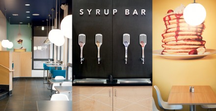
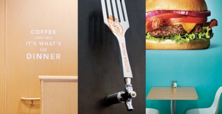
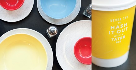
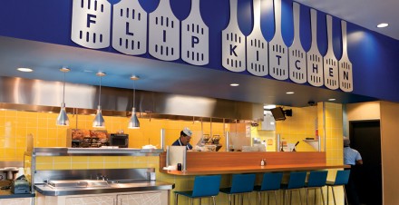
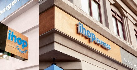
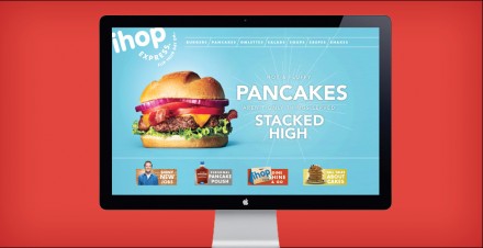
IHOP Express is a little different from the traditional IHOP that many of us are familiar with. Launched in 2011, IHOP Express was intended to serve evening and late night customers similar concepts that IHOP serves. The menu only needed to have “a little bit of breakfast in them”, a statement that worked as a diving board into a menu that was high on comfort. The ideas of the menu needed to also be reflected in the branding of the restaurant and BrandCory handled that. These ideas are clearly catered to the new generation of customer IHOP wants to serve, a younger, hipper version of older folks. The colors are bright. The design elements are modern. The graphics are engaging and sleek. The brand speaks fun all the way down to the syrup bar featuring spatula handles. I believe the branding works because deep down, I think they’re trying to market to the late-night Waffle House customer, certainly a younger bunch than the Sunday brunch crowd. It works because it’s a vibrant place and the kind of place you’ll feel positive energy walking into when it’s 2 in the morning. It’s a simple feeling but sometimes good brands become great with reinvention because of a simple little tweak.

