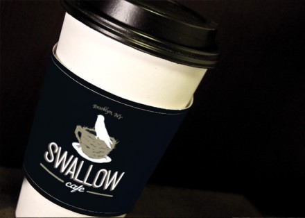
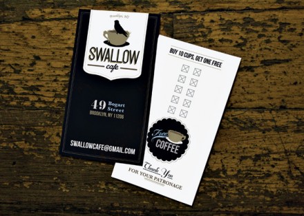
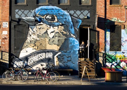
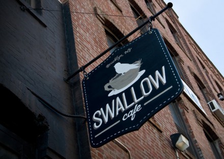
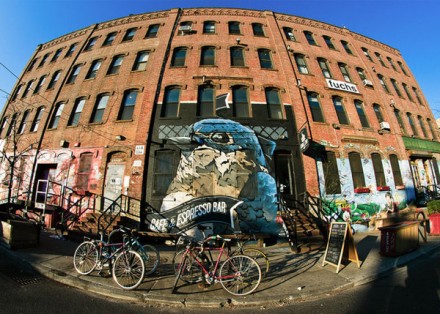
Scroll through Pinterest and you’ll learn quickly, if you didn’t know already, that handmade is the rage. However, in some ways handmade has always been one of the more popular design theories around and occasionally brandsters get a project that allows them to step away from the computer and step into the workshop and do some work with their hands that doesn’t require typing or moving a cursor. Swallow, a Brooklyn-based coffee and espresso bar, gave No Entry just this kind of job. Swallow has a vibe that ensures it stands out and fits in with Brooklyn, although their work is a prime example of branding for a specific locale. Their dominant store-front mural of a blue swallow would be out of place on many streets around the country, but where it stands it seems perfectly normal. Swallow’s branding centers around a nest-like coffee cup with a swallow hanging out on the rim. It has a quaint feel and it works well with the handmade aspects of the brand. The store’s hanging sign was designed and cut by hand and then of course it was painted by hand. It all comes together to create a brand that is imposing and striking, but its central features make it a pleasing visual image that captures eyes without being regretful. No Entry treated Swallow like it was an important part of the neighborhood and gave the company a brand that is monumental.

