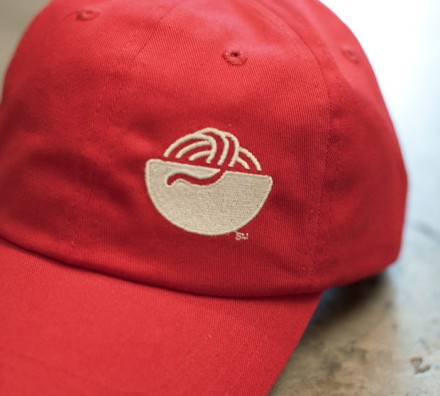
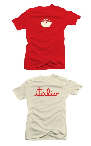
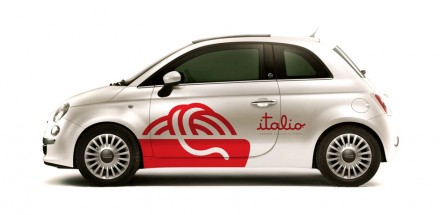
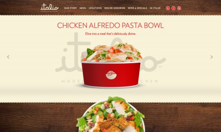
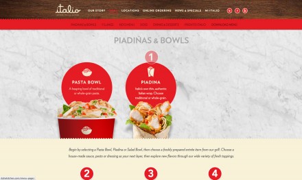
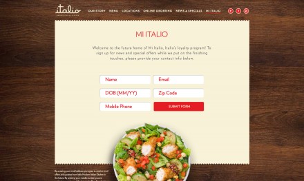
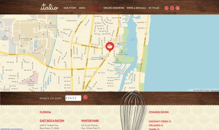
The Italian restaurant is one that could use some new life in the industry and Italio intended to do just that, but first they wanted a slick branding and marketing campaign to fit with their big ideas. PUSH gave them what they wanted, a modern look that pushes the envelope of what we’ve come to expect from how an Italian restaurant presents and positions itself. Italio’s intentions were to make a splash in the fast casual dining arena and beginning with the simple cursive, lowercase logo they’re well on their way. Italio itself is a great name, a moniker that is new but recognizable enough to supply the necessary implications. They developed a descriptor of the brand to accompany the logo, ” Modern Italian Kitchen” and while it’s a simple statement, it speaks loud and clear. They also developed three basic images of a sandwich and bowls that accompany much of the branding. It’s all quite simple and clean and it gets the job done with branding that is easily understood and transferable across numerous franchise locations.

