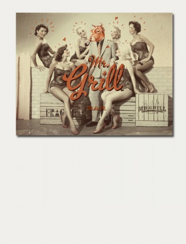
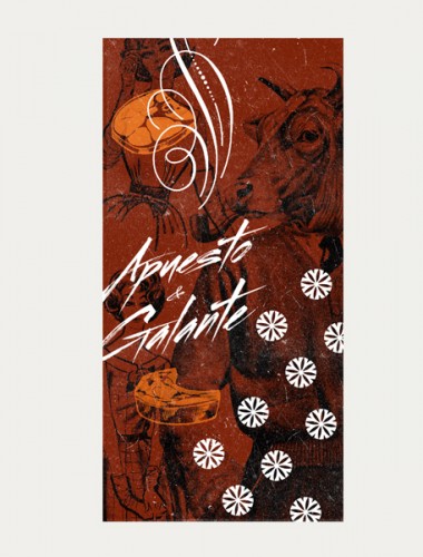
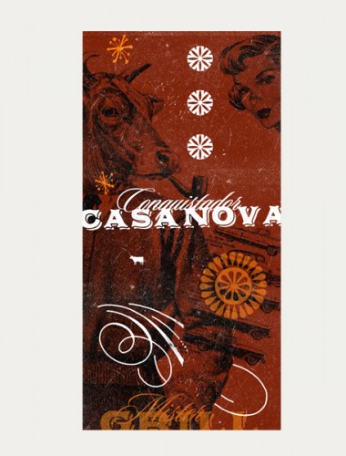
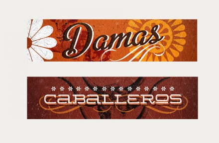
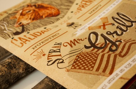
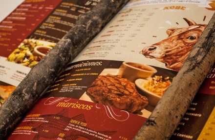
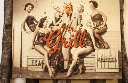
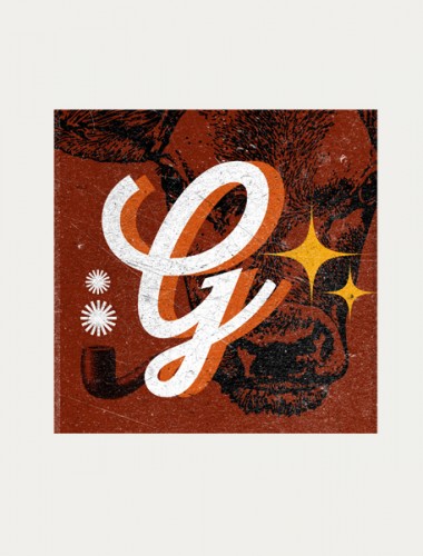
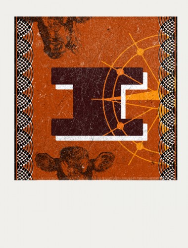
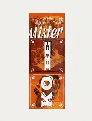
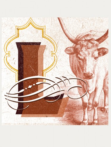
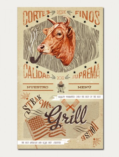
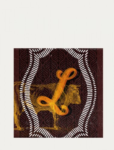
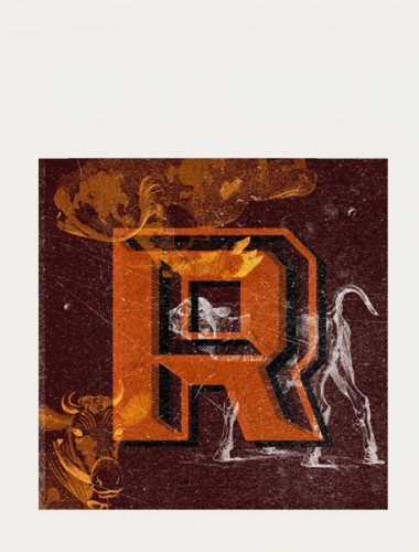
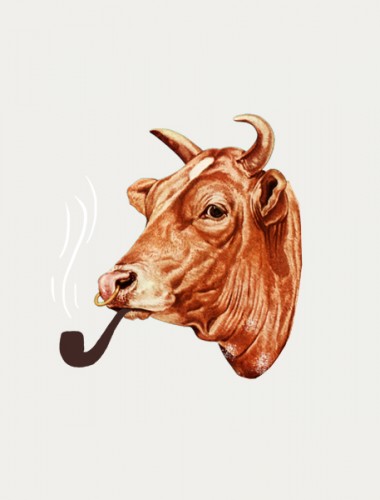
A quick Google search doesn’t reveal much about Mr. Grill, but trolling Estudio Yeye‘s website reveals a little more. I absolutely love this company’s work on Mr. Grill. It’s a highly creative concept with vintage, humorous and artistic visuals. Imagine the perfect bachelor and of course he’s a grill master while juggling two ladies at the Sunday evening block party. He’s cultured and proper so he’s always suited up, but he’ll always throw down on the grill. He’s known as “Mr. Grill” and this is his restaurant. The studio did a remarkable job creating brand visuals that are like elaborate collages serving as shrines to the cow. They’re layered and flash certain iconic symbols that ensure there’s no misunderstanding about the nature and content of this restaurant. The pipe-smoking cow headshot may be one of my favorite images of all time and something I’d want framed on my wall. I’d say that’s a success for Estudio Yeye and Mr. Grill. They hit on all the marks with this branding.

