Using A Foolproof Central Branding Image

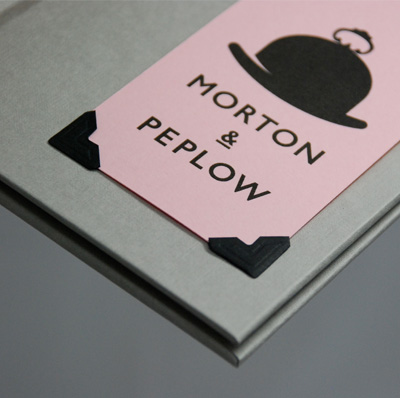
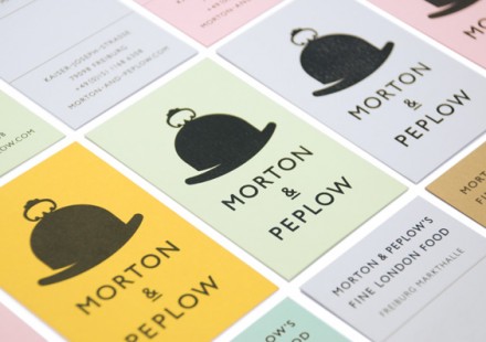
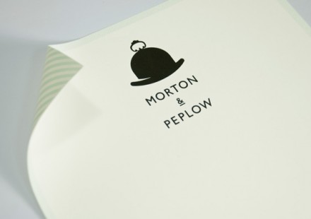
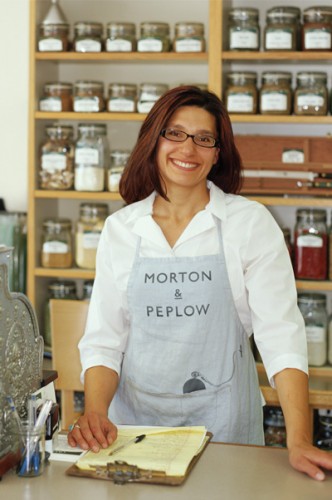
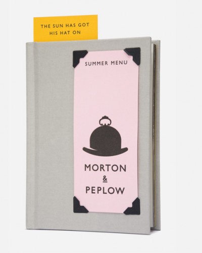
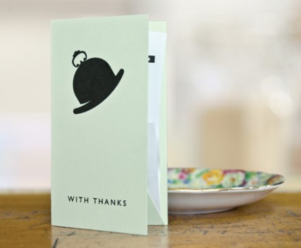
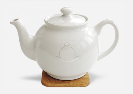
Morton & Peplow is a Munich restaurant that doles out British-inspired food and they naturally wanted a branding image that was consistent with all things Britain. Magpie Studios started with two iconic British symbols, the derby hat and a silver platter. They combined the two images into a single logo that maintains the characteristics of each, but creates a new, unique image for the business. They kept the vibe light with the pastel colors used in the branding line and the typography maintains the British heritage established with the two iconic symbols. Like so many branding cases, Morton & Peplow wanted to stay in the modern era with their food, but acknowledge the past with much of its branding. The key to doing this is to always make it timeless so that it doesn’t lose its aura over time. Magpie gave M & P a classic look and a central brand mark that can be used in a variety of ways. Timeless and versatile is always a good choice.

1247245096MP_01_menudetail

1247245132MP_02_cards

1247245138MP_03_lh

1247245145MP_04_apron

1247245150MP_05_menu

1247245159MP_06_tips

1247245164MP_07_receipt

1247245170MP_08_teapot

Discuss this Project

Leave a Reply

This site uses Akismet to reduce spam. Learn how your comment data is processed.

The Forktales Podcast™: Interviews with restaurant industry leaders and visionaries

Restaurant and advertising industry headlines and thinking

Reviews of restaurant experiences from around the globe 

Reviews of our favorite design, business, & restaurant books

Our favorite typography and fonts

Inspiration in your inbox

Get the latest inspiration in your inbox every Monday morning, for FREE!

"*" indicates required fields

This field is for validation purposes and should be left unchanged.

Delicious Bits in your Inbox!

Get the latest and greatest content delivered to your inbox for free!

"*" indicates required fields

This field is for validation purposes and should be left unchanged.