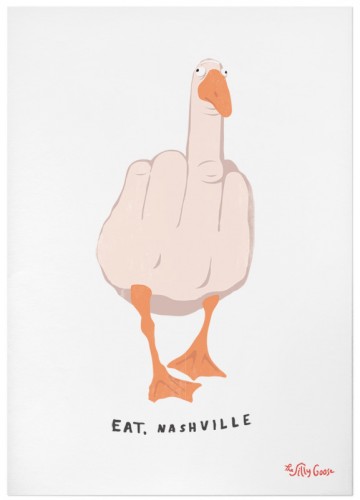
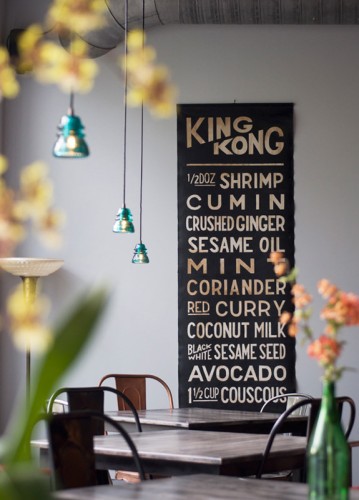
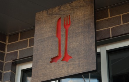
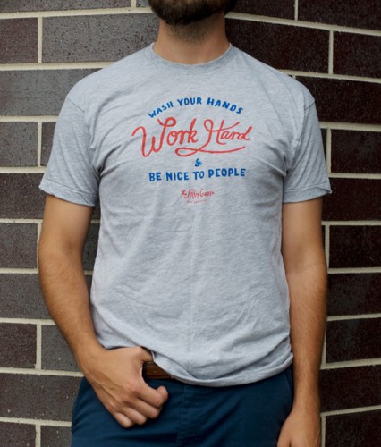
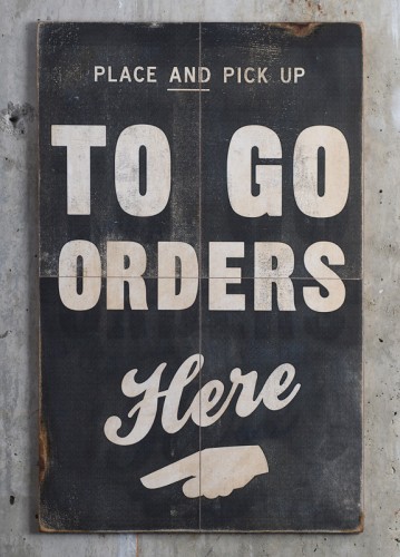
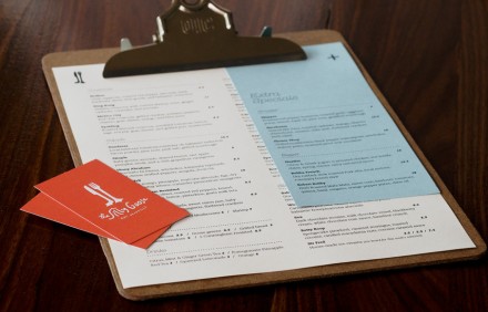
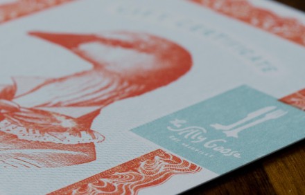
A modern American dining experience. You hear that phrase and you may think certain things, but Silly Goose, designed by Whiskey Theater, proves you can provide an elevated experience and still have some fun in the process. There’s a faded, vintage quality to the branding that Silly Goose carries, but it’s the imagery that really sticks with you. The goose is of course the central theme in the branding and they pay tribute to the hand turkey’s you made in kindergarten with their human hand goose, with one particular finger standing more prominently than the others. Sure, there are those that won’t take to that image too kindly, but those are probably not the guests Silly Goose is targeting. I love the knife and fork logo that serves as an entrance sign. The designers at WK used an old design trick: taking a recognizable image and morphing it into something that works separately. The knife and fork have webbed feet and it doesn’t take much mental work to figure out why. The entire branding work is dynamite, but I particularly love the recurring theme of the goose. The goose becomes the central character in the branding of the restaurant and it’s appearances in various ways works masterfully to tie the restaurant’s image all together.

