Branding Inspired By A Box

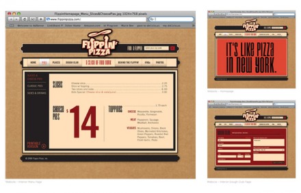
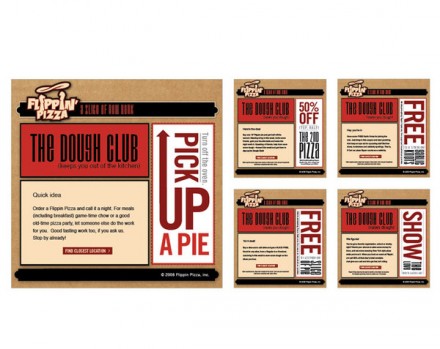
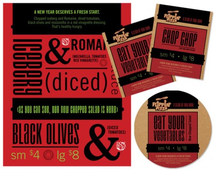
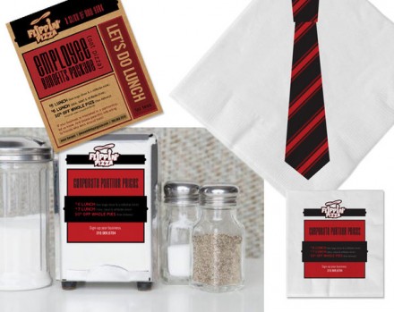
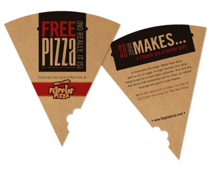
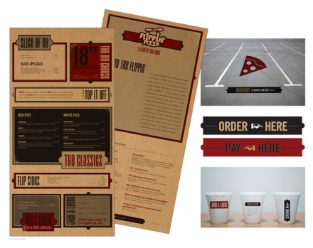
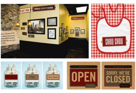
It’s not too often that a designer comes to a restaurant branding project that is starting from scratch, yet already has a logo to work with. With Flippin’ Pizza, that’s what Marie Bushbaum had to work with and naturally she used that as a launching point for the entire project. I think the use of the cardboard color as the foundation for much of the job is brilliant. Those cardboard pizza boxes carry a close association, once again, naturally, with pizza and it’s enough of a neutral to work as the base. I like the creative marketing of the pizza slice for a free slice during the grand opening. Bushbaum made the material very block-oriented, making the text-heavy work relatively easy to read. There’s not a lot of frill to this work, but I like the purity of it. It’s cleverly worded, easy on the eyes and the “Chew Chew” baby bib–brilliant!


794141218513366

794141234730821 794141234730851

794141234730891

794141234730933

794141218513221 794141218513347

Discuss this Project

Leave a Reply

This site uses Akismet to reduce spam. Learn how your comment data is processed.

The Forktales Podcast™: Interviews with restaurant industry leaders and visionaries

Restaurant and advertising industry headlines and thinking

Reviews of restaurant experiences from around the globe 

Reviews of our favorite design, business, & restaurant books

Our favorite typography and fonts

Inspiration in your inbox

Get the latest inspiration in your inbox every Monday morning, for FREE!

"*" indicates required fields

This field is for validation purposes and should be left unchanged.

Delicious Bits in your Inbox!

Get the latest and greatest content delivered to your inbox for free!

"*" indicates required fields

This field is for validation purposes and should be left unchanged.