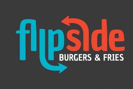
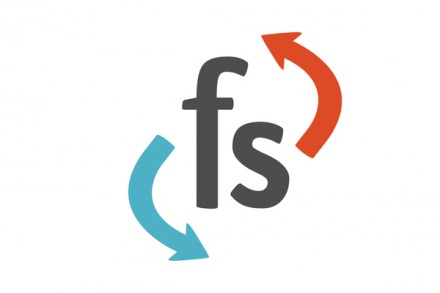
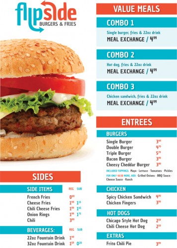
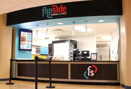
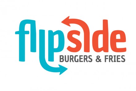
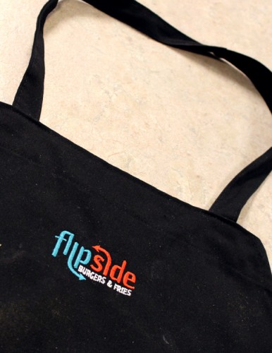
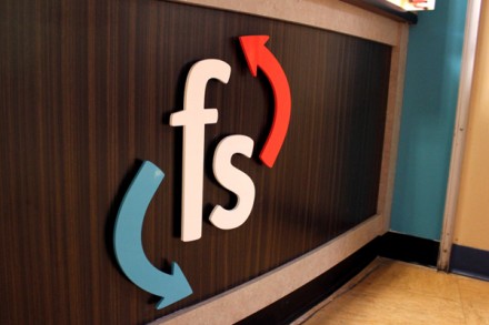
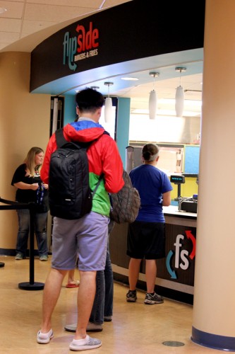
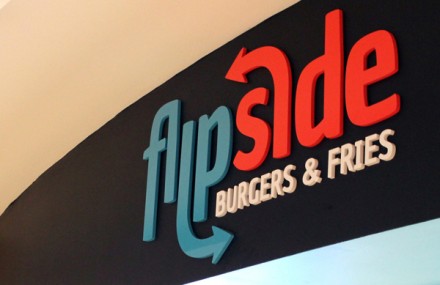
Sometimes it’s important to remember who the primary audience is when considering branding options. In the case of Flipside Burgers & Fries on the campus of University of Nebraska Kearney, that’s exactly what appears to have happened. Dani Donovan designed the branding for the location while working for the university’s dining services team and it’s a clean look without a lot of frills. If I think back to my college days of eating on campus, I wanted fast food (literally) and I didn’t care much about the accoutrements of the brand if the food was decent and something dependable. Bonus points were given if the brand had an appearance of something worth my time. The look Donovan gave Flipside works well for it’s campus setting. The burger joint knows its target audience so there’s no need to go over the top with branding flash and sizzle. She kept the branding clean and simple and while I’d love to see branding that projects a little more about what the product is, does or can be, I get the direction she took the image. I like the use of arrows, a trend that has performed well in recent years of branding. I also like the color scheme, but I’m not crazy about the logo using the initials and just two arrows. I’d love to see something a little more central to the brand and iconic. I’m not a big fan of initials unless they can convey the same message the brand’s name can. Overall I think it’s a successful branding job. The brand has a youthful, fast-serve feel and all things considered, it’s quite simple. It works on campus for the audience found there, but I’m not sure it would survive in a more competitive marketplace.

