Colorful Salad Branding

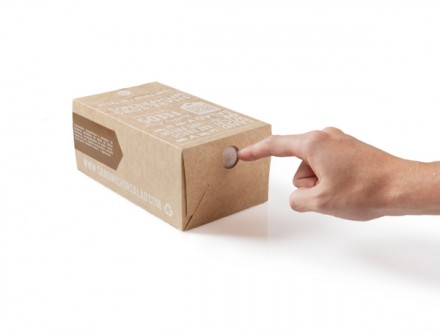
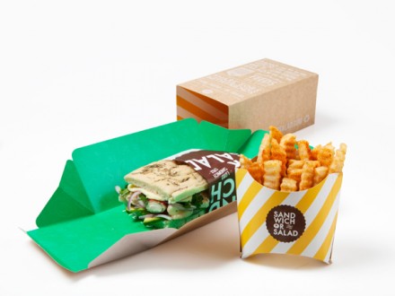
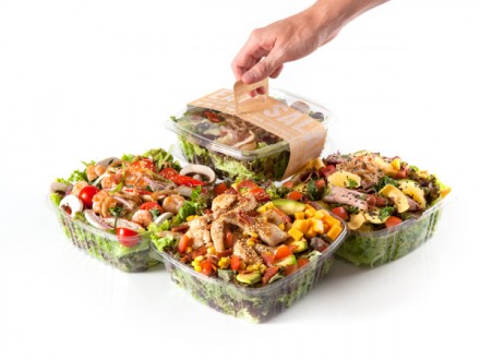
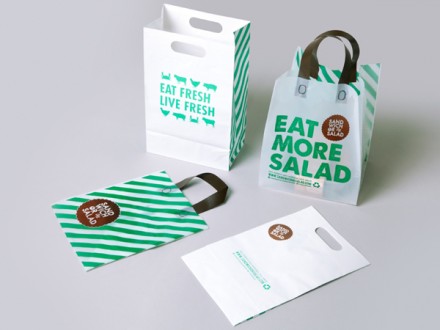
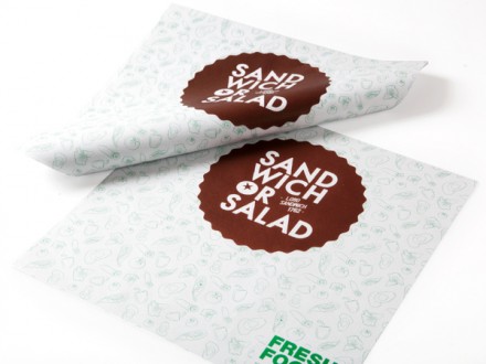
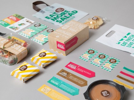
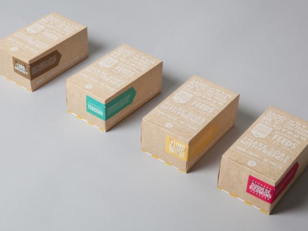
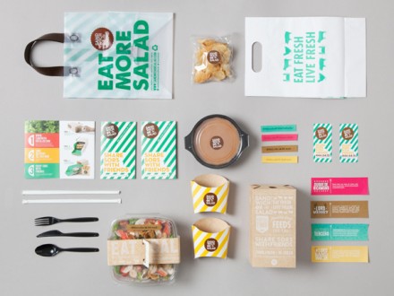
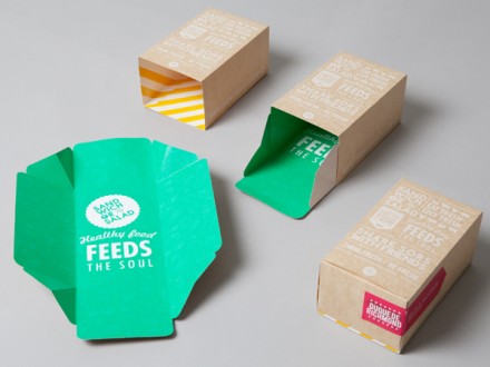
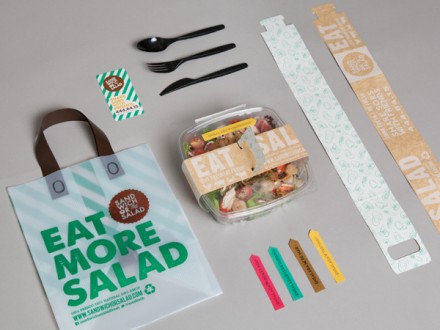
Sandwich or Salad’s branding work, created by Colombian designers Masif, captures the fresh-living brand vibe the restaurant appears to be striving for. Using a simple palate of greens and browns, Masif took slogans like “Eat More Salad” and “Eat Fresh, Live Fresh” and translated that into a presentation that is clean, green and, appropriately enough, fresh. The brand logo is a badge with crimped edges, making it appear like a sticker affixed to all the material. It’s a trustworthy logo and is easily transferred across all avenues used. The packaging created by Masif is a good blend of clever and useful. The branding is colorful and alive, kind of like a salad, and that’s considered a successful job by most folks.

3d47cf380c198b2516c4050e2292296e

4c04ff91e8703aae50daa19af4be9984


29f1f89a92b6bed69ba67d64504a33a7

39af0ce1e2cda358c928c6ef0b6e9489

81aa23438d415980cb2ec71e3c237591

90f8628569d93cdc4334107447ac6933

302bb192ed0f0bdd1b85679eb7911348

5802a28a3e07dea5402f57d73b9f6015

37922697bce0dc990a21dbb4f2d7b86a

b2aab909a746897974c00285f97c045f


Discuss this Project

Leave a Reply

This site uses Akismet to reduce spam. Learn how your comment data is processed.

The Forktales Podcast™: Interviews with restaurant industry leaders and visionaries

Restaurant and advertising industry headlines and thinking

Reviews of restaurant experiences from around the globe 

Reviews of our favorite design, business, & restaurant books

Our favorite typography and fonts

Inspiration in your inbox

Get the latest inspiration in your inbox every Monday morning, for FREE!

"*" indicates required fields

This field is for validation purposes and should be left unchanged.

Delicious Bits in your Inbox!

Get the latest and greatest content delivered to your inbox for free!

"*" indicates required fields

This field is for validation purposes and should be left unchanged.